Strategy
Positioning · Target AudienceBrand Goals · Competitive Analysis
Drag to resize. Use Arrow Up to expand, Arrow Down to reduce, or Escape to close.
PICK SOMETHING UP.
Yours starts with a decision.
PSSST… START DOWN HERE.
CHOOSE YOUR FIRST INGREDIENT
Positioning · Target AudienceBrand Goals · Competitive Analysis
Logo Suite · Color PaletteTypography · Visual Elements
Website · Customer JourneyBrand Touchpoints · User Experience
EXPLORE THE BOARD.
Pick a thought. Get to know the creative.
01 / THE MIND
“I don’t start with what looks good. I start with what makes sense. Because good design should solve something.”
02 / THE METHOD
“Every decision has a reason. From the first conversation to the final detail, strategy leads the creative.”
03 / THE MISSION
“I want businesses to look as credible as the work they put in. Not just stand out, but stand for something.”
04 / THE PERSONALITY
“I’m curious by nature. If there’s a more interesting way to do something, I’m probably already experimenting with it.”

CREATIVE BRAND STRATEGIST
+ WEB EXPERIENCE CURATOR
I turn strategy, design, and digital experiences
into brands built to show up different.

THE PERSON BEHIND THE WORK
Creative Brand Strategist
+ Web Experience Curator
I help businesses turn ideas into brands people understand, remember, and trust. My work lives at the intersection of strategy, visual identity, graphic design, and digital experience.
For more than a decade, I’ve helped shape over 1,000 brands across industries, but the goal has never been to simply make things look good.
The goal is to make them make sense.
I’m Gerald.
Designer turned strategist turned “wait… what if the website did this?”
I like figuring out why something works just as much as I enjoy making it look good. Most of my creative rabbit holes start with one question:
“Could this be better?”
I DIDN’T JUST LEARN DESIGN. I LEARNED HOW BRANDS WORK.
01 / THE EVOLUTION
Learning the tools, mastering visual communication, and discovering what makes design work.
02 / THE EVOLUTION
Realizing that logos were only one piece of a much larger story.
03 / THE EVOLUTION
Moving upstream into positioning, audience, messaging, customer journeys, and brand direction.
04 / THE EVOLUTION
Bringing strategy, branding, technology, interaction, and web design together into complete experiences.
05 / STILL EXPLORING
Exploring new ways to combine creative thinking, interaction, and technology to build brands differently.
ONLINE NOW
The work you don’t see behind the work you do.
Footage will appear here when it’s ready.
THAT’S A WRAP.
ON THE MONITOR / 01
Where creativity meets concentration.
THE FILE STAYS OPEN. THE POSSIBILITIES DO TOO.
Let’s see what we can build.
BACK TO ENTRANCE
I’m Gerald, a creative brand strategist and web experience curator helping businesses build brands with clarity, personality, and purpose.
My approach combines strategic thinking with intentional design to create identities and digital experiences that connect with the right people.
Get to Know Me





Media features and collaborations associated with clients.
Click on a project to learn more.
grab or scroll to explore
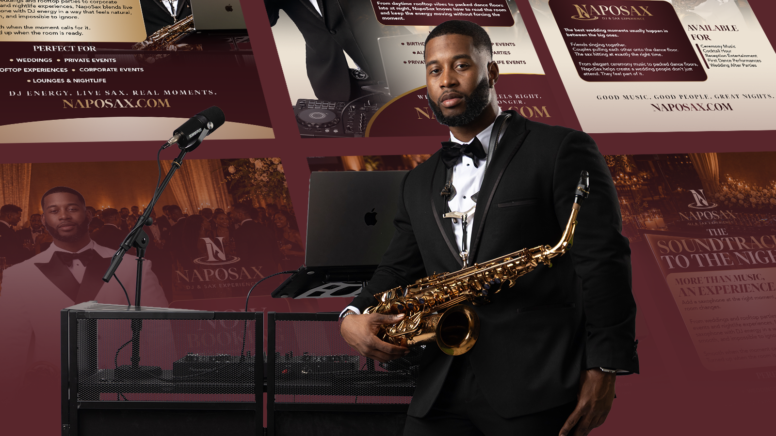
An Elevated Brand for an Elevated Experience
Napoleon Holliday, professionally known as NapoSax, is a traveling saxophonist and DJ bringing live entertainment and unforgettable energy to events.
As his services evolved, his brand needed to evolve with him.
The mission was to create a more elevated presence that reflected his expanding capabilities and positioned NapoSax for a higher-end audience.
02 / THE BRIEF
Having collaborated on a previous branding project, we reunited to take NapoSax into his next chapter.
With DJ services now complementing his signature saxophone performances, the existing brand needed a strategic refresh.
The objective was to reposition NapoSax for a more premium audience while creating a cohesive identity that communicated sophistication, versatility, and an unforgettable entertainment experience.
Evolve an established entertainment brand to reflect expanded services and appeal to a higher-end clientele without losing the personality and energy that made NapoSax recognizable.
Create a premium brand experience that positions NapoSax as a sought-after entertainer for clients who value exceptional live music, atmosphere, and memorable experiences.
Brand strategy, brand repositioning, visual identity, social media kit, promotional assets, and a complete website redesign.
03 / THE STRATEGY
We weren’t just refreshing the visuals. We were redefining how NapoSax showed up, who he spoke to, and the experience his brand promised.
From entertainer to premium experience.
We repositioned NapoSax to appeal to clients seeking more than live music. The focus shifted toward the complete entertainment experience, combining musical talent, versatility, and atmosphere.
Sophistication with a little soul.
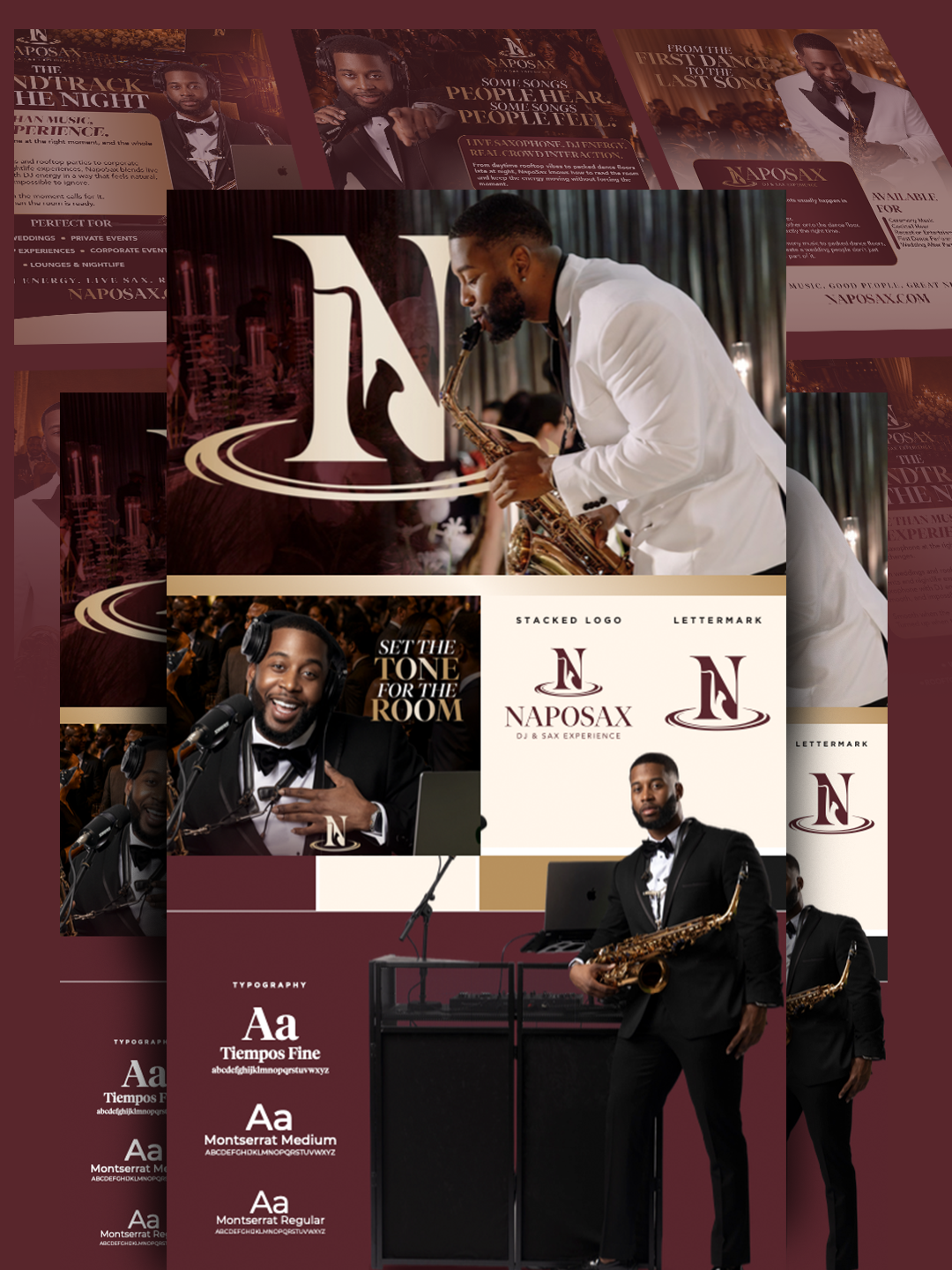
A rich burgundy, warm champagne gold, and refined visual elements established an upscale aesthetic without sacrificing the energy and personality behind the performances.
One identity. Every touchpoint.
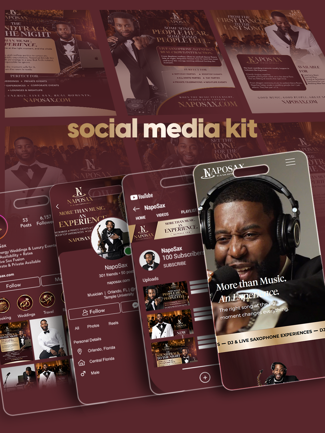
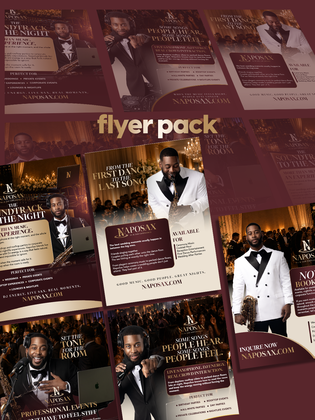
We carried the new direction across the visual identity, social media assets, promotional materials, and website, creating a consistent brand experience wherever potential clients discovered NapoSax.
04 / THE WORK
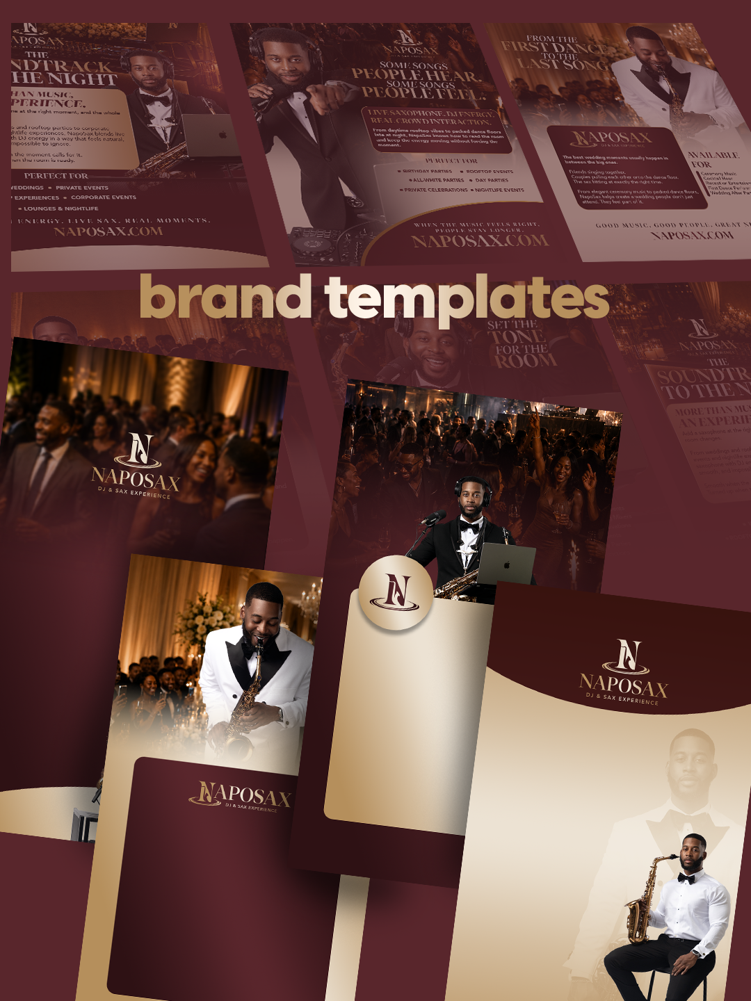
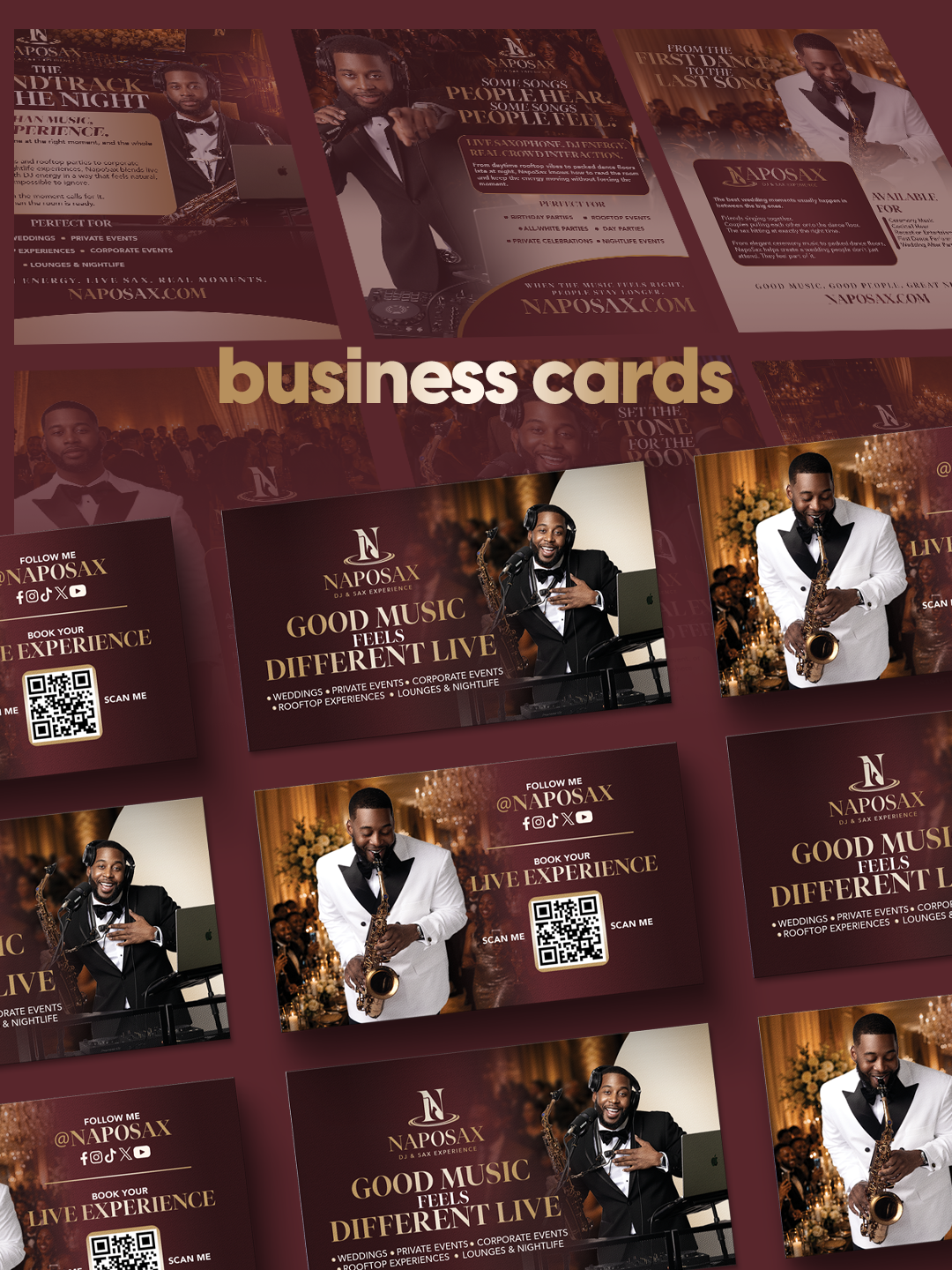
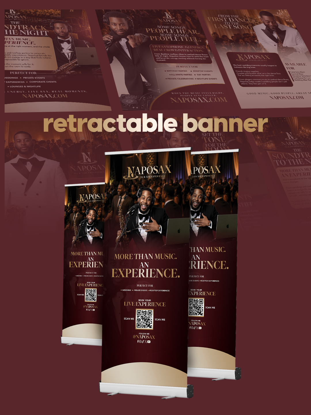
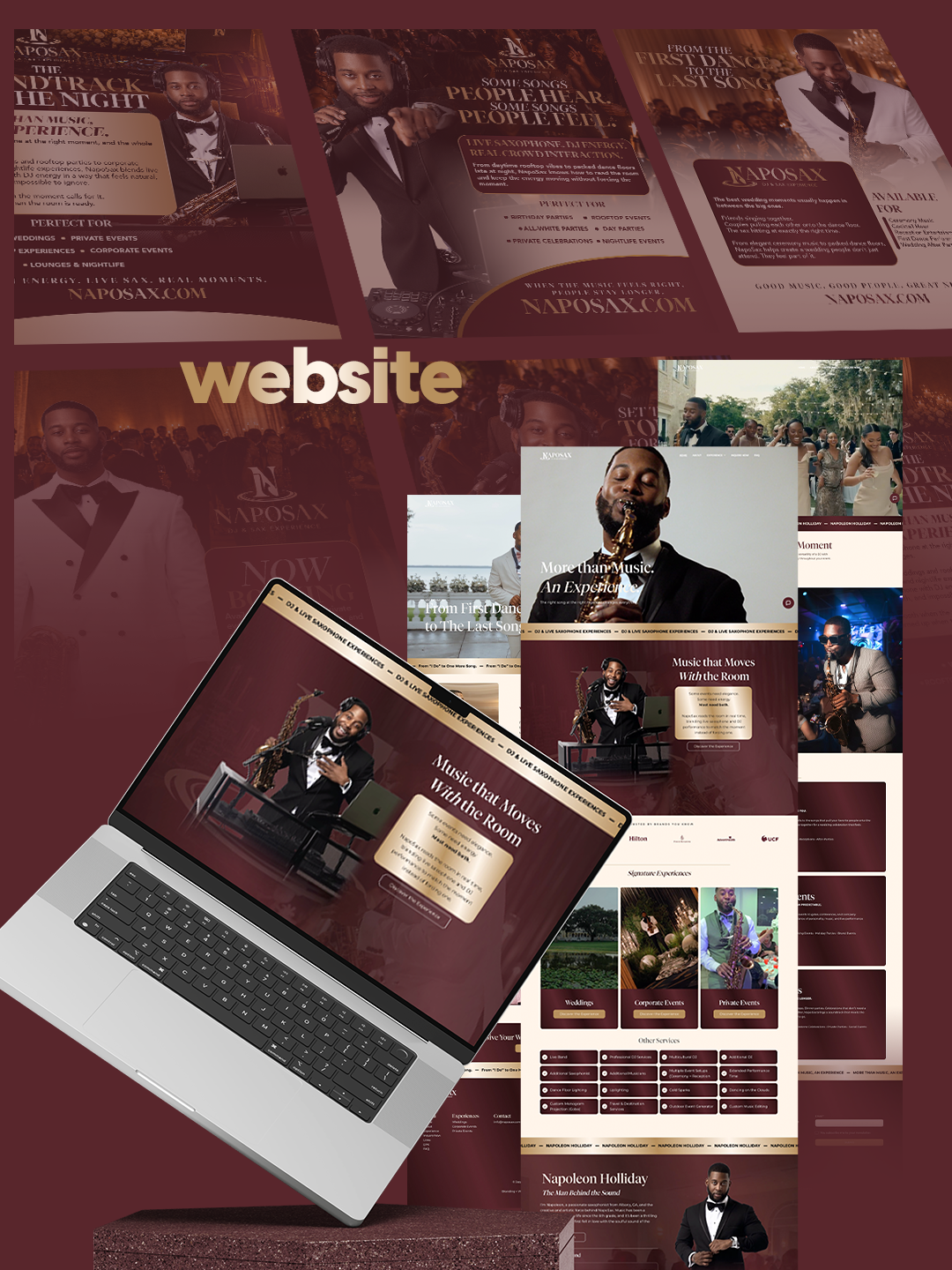
A cohesive collection of brand assets designed to make every first impression feel as elevated as the experience itself.
A refined visual direction built around sophistication, versatility, and entertainment.
Branded content designed to create consistency and strengthen his digital presence.
Marketing visuals that communicate the NapoSax experience with clarity and impact.
A refreshed digital destination bringing his expanded services and elevated brand positioning together.
05 / THE OUTCOME
A stronger brand presence. A more refined audience. More opportunities to perform.
NapoSax emerged with a cohesive brand identity that reflects both his established reputation as a saxophonist and his expanded services as a DJ.
Every visual touchpoint now communicates a more sophisticated entertainment experience.
The redesigned website and supporting brand assets created a unified digital presence, making it easier for prospective clients to explore his services and understand the value of the NapoSax experience.
The repositioning helped NapoSax connect with his desired audience, strengthen his reach, and generate more bookings while establishing a foundation for continued growth.
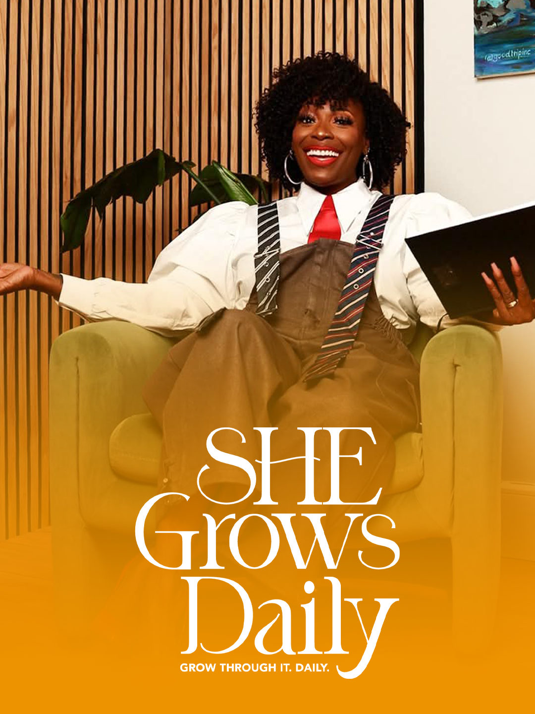
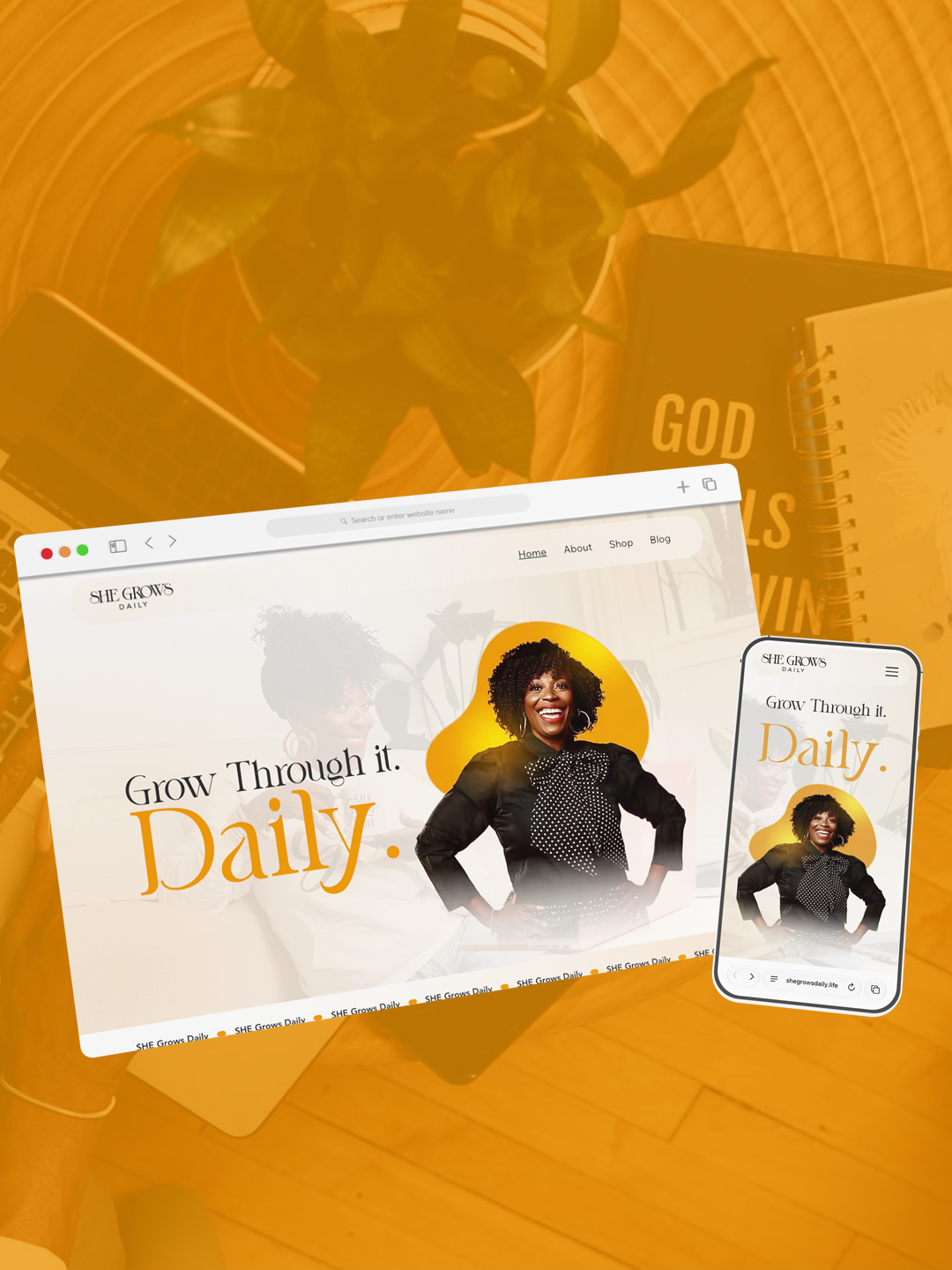
Rooted in Faith. Designed for Growth.
She Grows Daily is a faith-centered personal development platform created to empower women through intentional growth, healing, and self-discovery.
With a mission rooted in mental, spiritual, and emotional well-being, the brand needed an identity that reflected its purpose while creating room for future expansion into clinical services.
The vision was meaningful. Our job was to give it a recognizable presence.
02 / THE BRIEF
She Grows Daily began with a logo, a Facebook page, and a powerful mission to help women become better versions of themselves.
What was missing was a cohesive identity and a dedicated digital experience that could communicate the brand’s purpose, connect with its audience, and support its growing services.
The challenge was to transform an emerging platform into a recognizable, welcoming brand rooted in empowerment, faith, healing, and community.
Establish a distinctive and consistent brand identity for a growing personal development platform that previously relied on a standalone logo and Facebook presence.
Build an empowering, faith-centered brand experience that inspires confidence, creates meaningful connections, and supports the platform’s long-term vision.
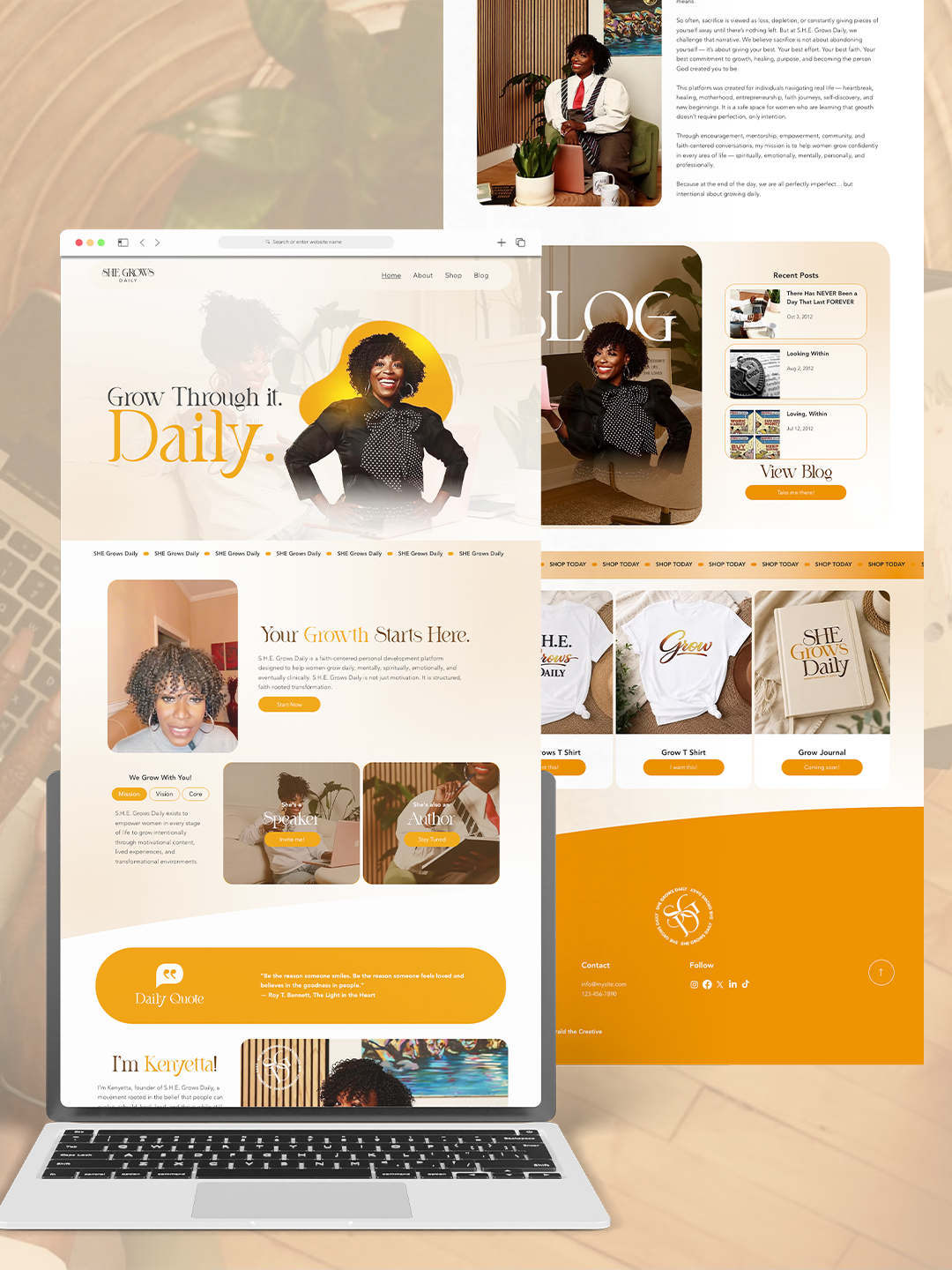
Brand strategy, visual identity development, and a responsive one-page website with integrated e-commerce and booking functionality.
03 / THE STRATEGY
The strategy centered on creating more than a recognizable identity. Every decision needed to reinforce the brand’s purpose, connect with the women it serves, and establish a foundation for continued growth.
A space for women becoming.
We positioned She Grows Daily as a welcoming, faith-centered destination for women seeking personal growth, encouragement, and meaningful transformation.
The messaging focused on empowerment, healing, community, and the belief that growth is an ongoing journey.
Warmth, purpose, and possibility.
We developed a visual direction that balanced warmth and optimism with clarity and confidence.
A welcoming palette of golden orange, soft beige, and white helped establish an approachable identity that feels uplifting, intentional, and rooted in growth.
A brand designed to grow with her.
We translated the strategy into a cohesive visual identity and a streamlined digital experience.
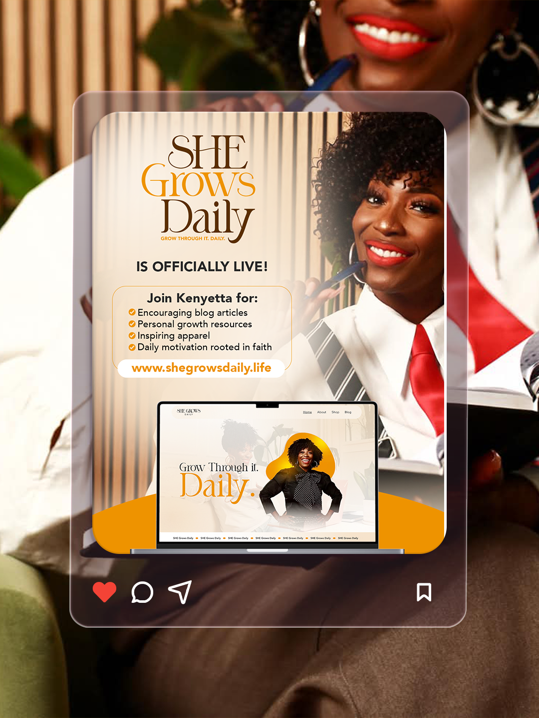
The one-page website brings the brand’s mission, offerings, e-commerce, and booking functionality together, creating a central destination for the community she is building.
04 / THE WORK
A thoughtful brand identity and digital experience designed to turn a meaningful mission into a recognizable presence.
A clear foundation built around faith, empowerment, healing, and personal growth.
A warm, cohesive identity that communicates encouragement, confidence, and connection.
A responsive one-page experience that introduces the platform, communicates its purpose, and guides visitors toward its offerings.
Integrated functionality that allows the platform to support purchases and appointment bookings within one digital destination.
05 / THE OUTCOME
From a logo and a Facebook page to a brand ready to grow.
She Grows Daily launched with a cohesive visual identity and a dedicated website that brought its mission, messaging, and offerings into one recognizable brand experience.
What began as a developing idea now has a clearer foundation and a more consistent presence.
The new website provides a welcoming destination where women can discover the platform, explore its offerings, and take meaningful next steps through integrated shopping and booking features.
Every element was designed to make the experience approachable, purposeful, and easy to navigate.
The completed brand gave its founder greater confidence in presenting She Grows Daily to the world.
With a professional identity, a launched digital platform, and the infrastructure to connect with its intended audience, the business now has a stronger foundation for future growth and expanded services.
A Familiar Feeling. A Whole New Identity.
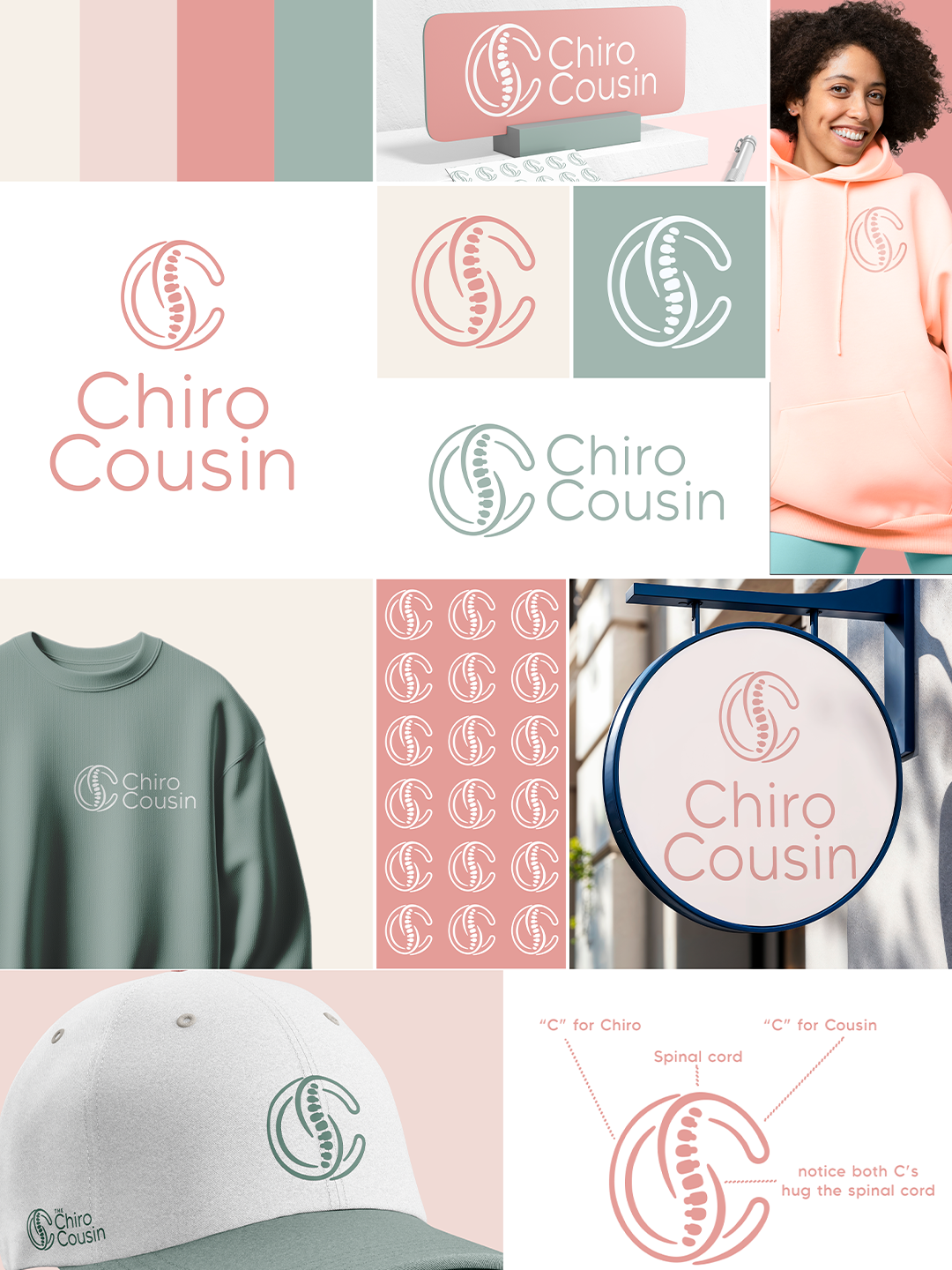
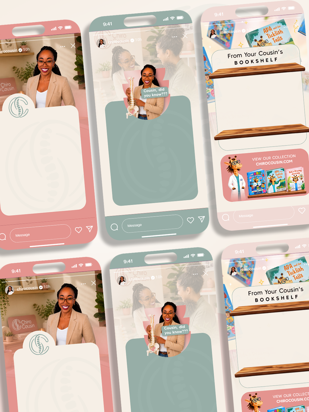
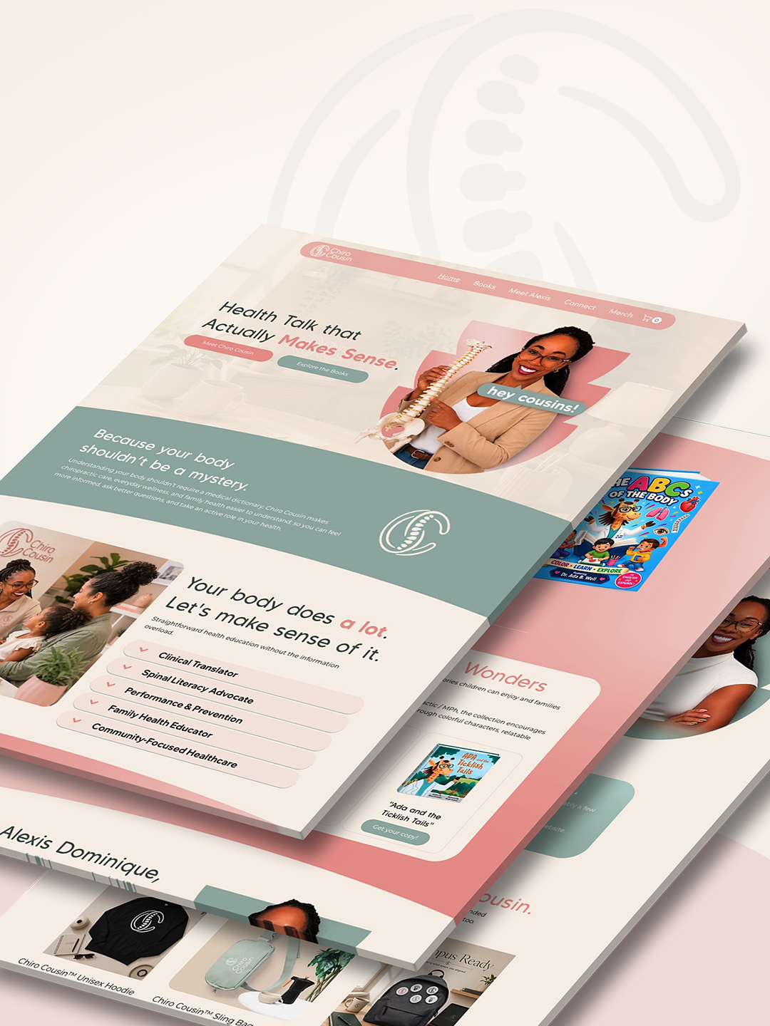
Created by Alexis Dominique, a future Doctor of Chiropractic pursuing a Master of Public Health, Chiro Cousin makes chiropractic education and wellness conversations approachable and relatable.
The brand evolved from Becoming Doc Ada into a welcoming identity that could grow alongside Alexis's professional journey.
02 / THE BRIEF
Alexis envisioned a brand that felt like a digital hug from a family member: familiar, encouraging, and trustworthy. The challenge was to evolve her existing identity into Chiro Cousin while preserving her personality and preparing for future professional growth.
Transition an existing personal brand into a warm, recognizable identity without sacrificing credibility.
Create an inviting brand and website that make wellness education feel accessible and can evolve with Alexis's career.
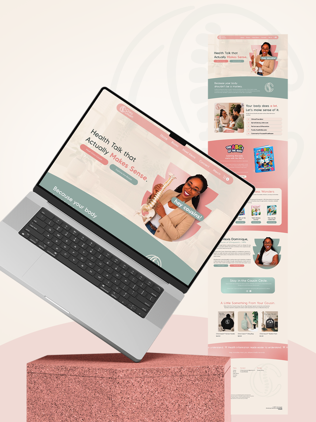
Strategic brand identity and responsive one-page website redesign.
03 / THE STRATEGY
Every creative decision focused on building familiarity and trust while leaving room for the brand to grow.
Not just a future doctor. Your Chiro Cousin.
We positioned Alexis as an approachable, relatable voice in chiropractic education and wellness.
A digital hug, by design.
Soft blush, dusty rose, and warm ivory create a comforting visual language that feels personal rather than clinical.
Built for today. Ready for what's next.
The identity and redesigned one-page website provide a cohesive foundation for Alexis's current educational work and future offerings.
04 / THE WORK
A warm, personality-driven rebrand that makes professional wellness education feel familiar and welcoming.
A clear positioning foundation rooted in accessibility, trust, and connection.
A soft, recognizable identity designed to feel like a digital hug.
A welcoming one-page experience introducing Alexis and her evolving mission.
05 / THE OUTCOME
A brand she can confidently show up for. Anywhere.
Chiro Cousin emerged with a distinctive visual identity and digital presence that reflects Alexis’s personality, purpose, and evolving professional journey.
The transition from Becoming Doc Ada established a clearer, more recognizable brand built around connection and trust.
The redesigned website creates a welcoming space for visitors to learn about Alexis, explore her educational content, and connect with the Chiro Cousin brand.
Its flexible structure also provides room for future expansion as her professional qualifications and offerings evolve.
The rebrand gave Alexis renewed confidence in how she presents herself and her work.
With a cohesive identity and digital presence, she can show up confidently both online and offline, knowing her brand reflects who she is today and where she’s headed.
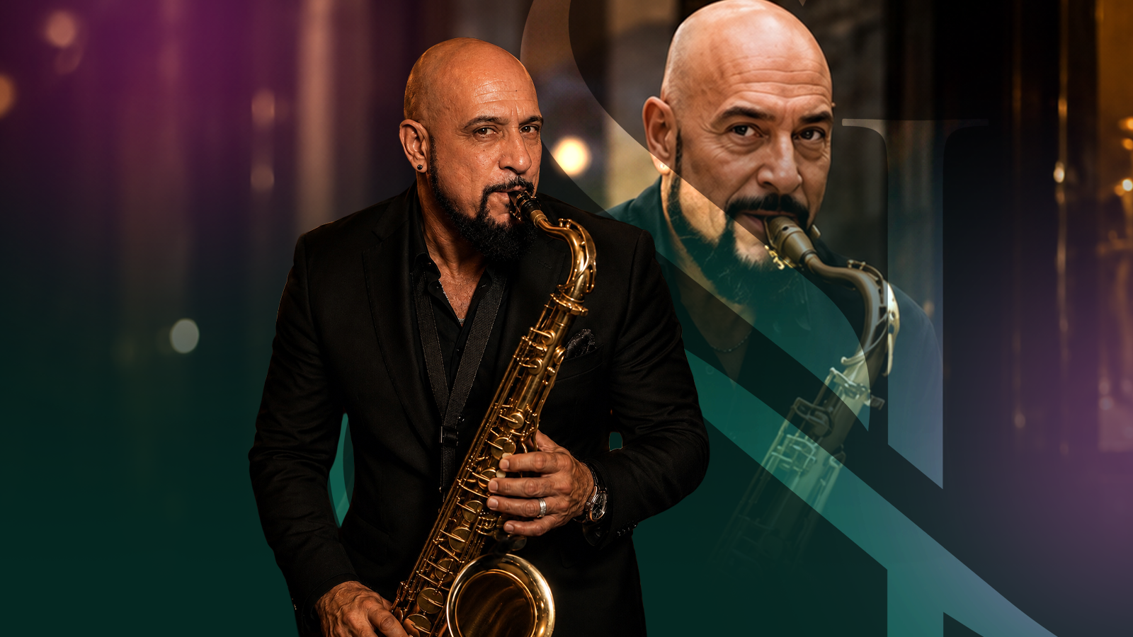
Decades of Talent. A Brand to Match.
South Jersey musician Stephen Lombardelli is a versatile multi-instrumentalist with more than 25 years of professional experience spanning saxophone, keyboards, and woodwinds.
His musical reputation was established, but his visual and digital presence did not reflect the depth of his career.
02 / THE BRIEF
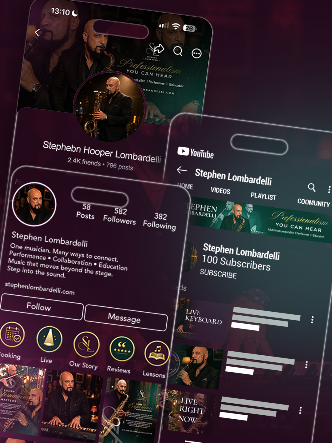
Stephen had no logo, brand strategy, dedicated website, or consistent visual identity. His online presence relied on occasional Facebook and Instagram posts. He needed a professional brand that felt smooth, memorable, and worthy of his experience.
Translate decades of musical expertise into a recognizable brand from the ground up.
Establish a sophisticated identity and digital home that showcase Stephen's versatility and help prospective clients connect with him.
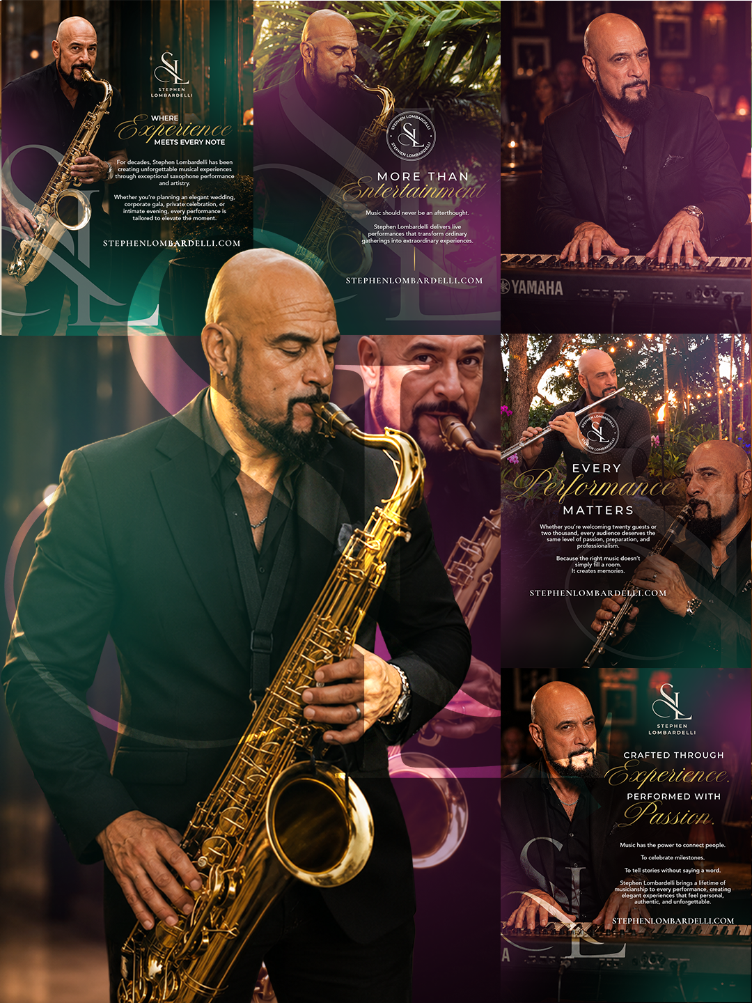
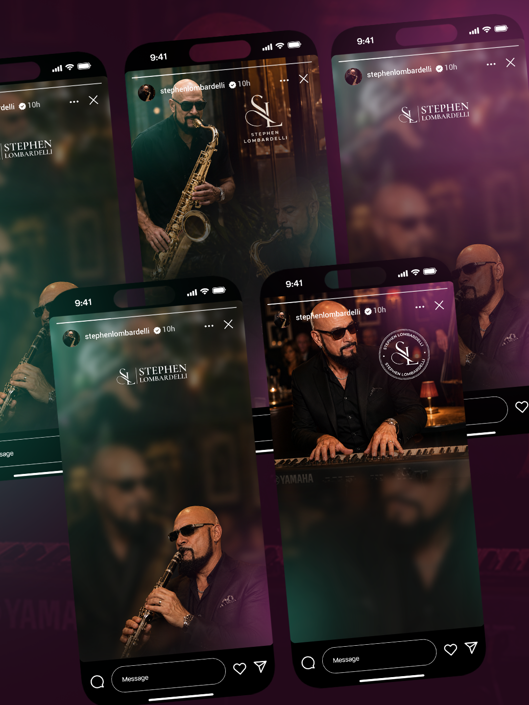
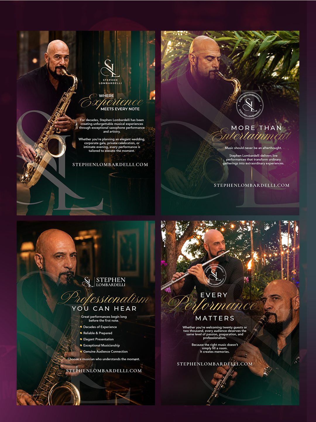
Brand strategy, visual identity, social media kit, printed materials, and full website.
03 / THE STRATEGY
The strategy focused on turning an established reputation into a polished, consistent brand experience.
Experience deserves a presence.
We positioned Stephen as a seasoned, versatile musician whose expertise spans instruments, settings, and audiences.
Smooth. Sophisticated. Unforgettable.
Deep plum, forest green, warm beige, and antique gold support an understated, timeless visual direction.
A legacy, brought into focus.
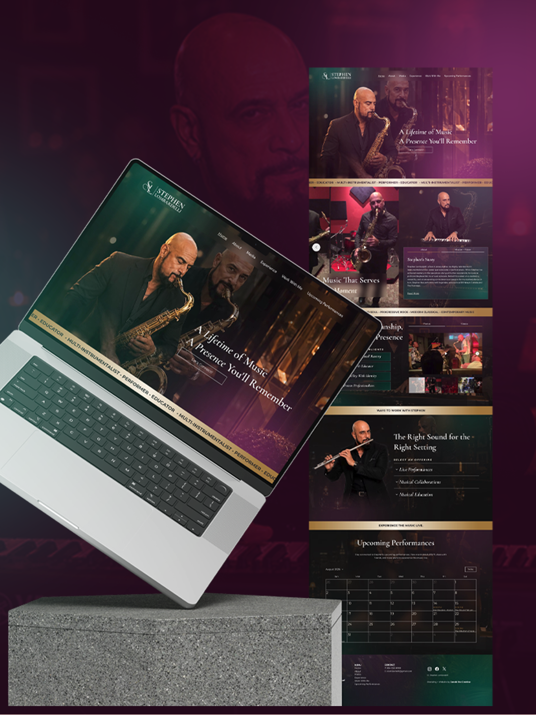
We carried the identity across digital and print materials and a full website featuring performances, galleries, schedule, and inquiries.
04 / THE WORK
A complete brand presence designed to give decades of musical excellence the recognition it deserves.
A distinctive identity reflecting Stephen's professionalism and versatility.
Consistent branded graphics for his digital channels.
Coordinated materials for professional promotion.
A digital destination for photos, performance videos, schedule, and booking inquiries.
05 / THE OUTCOME
The talent was always there. Now the brand speaks for itself.
Stephen Lombardelli now has a cohesive professional identity that reflects the experience, versatility, and musical excellence he has spent decades developing.
From the visual identity to the supporting marketing materials, every touchpoint communicates a consistent and recognizable brand.
The new website gives visitors a central destination to explore Stephen’s work, browse his photo gallery, watch performances, view his upcoming schedule, and submit booking inquiries.
Rather than relying solely on social media, Stephen now has a dedicated platform that presents his career and services in a more comprehensive, professional way.
The project transformed Stephen’s previously limited digital presence into a complete brand experience.
With a distinctive identity, coordinated marketing assets, and a fully developed website, Stephen now has the tools to confidently showcase his talent, connect with prospective clients, and support future performance opportunities.
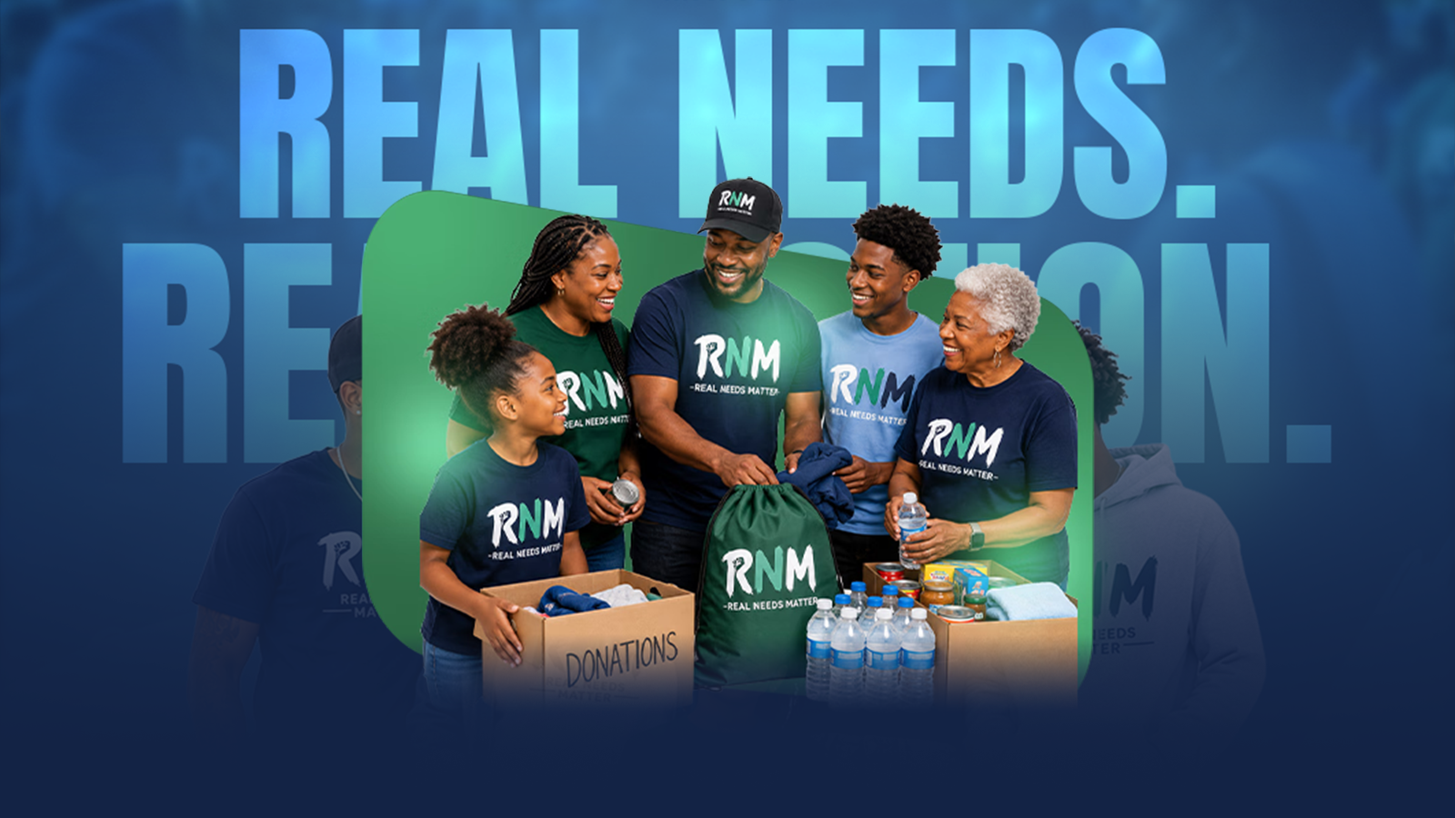
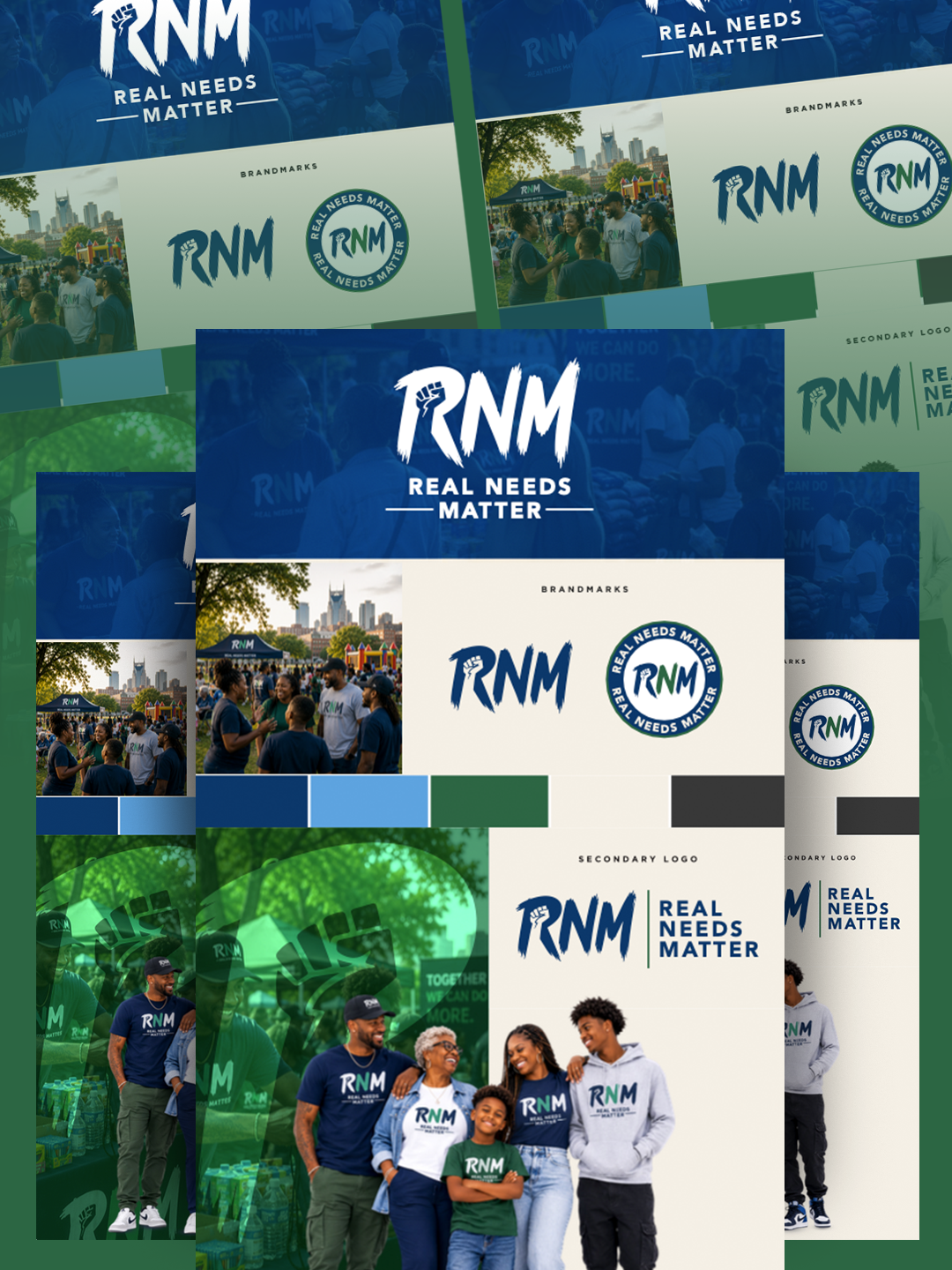
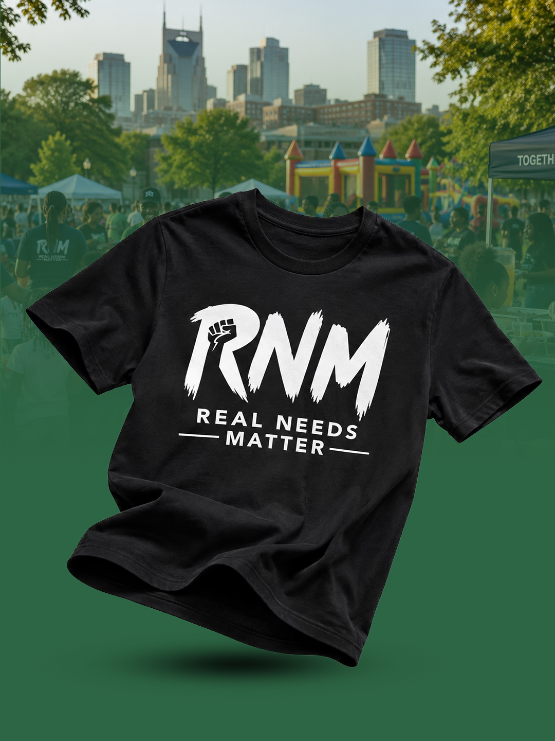
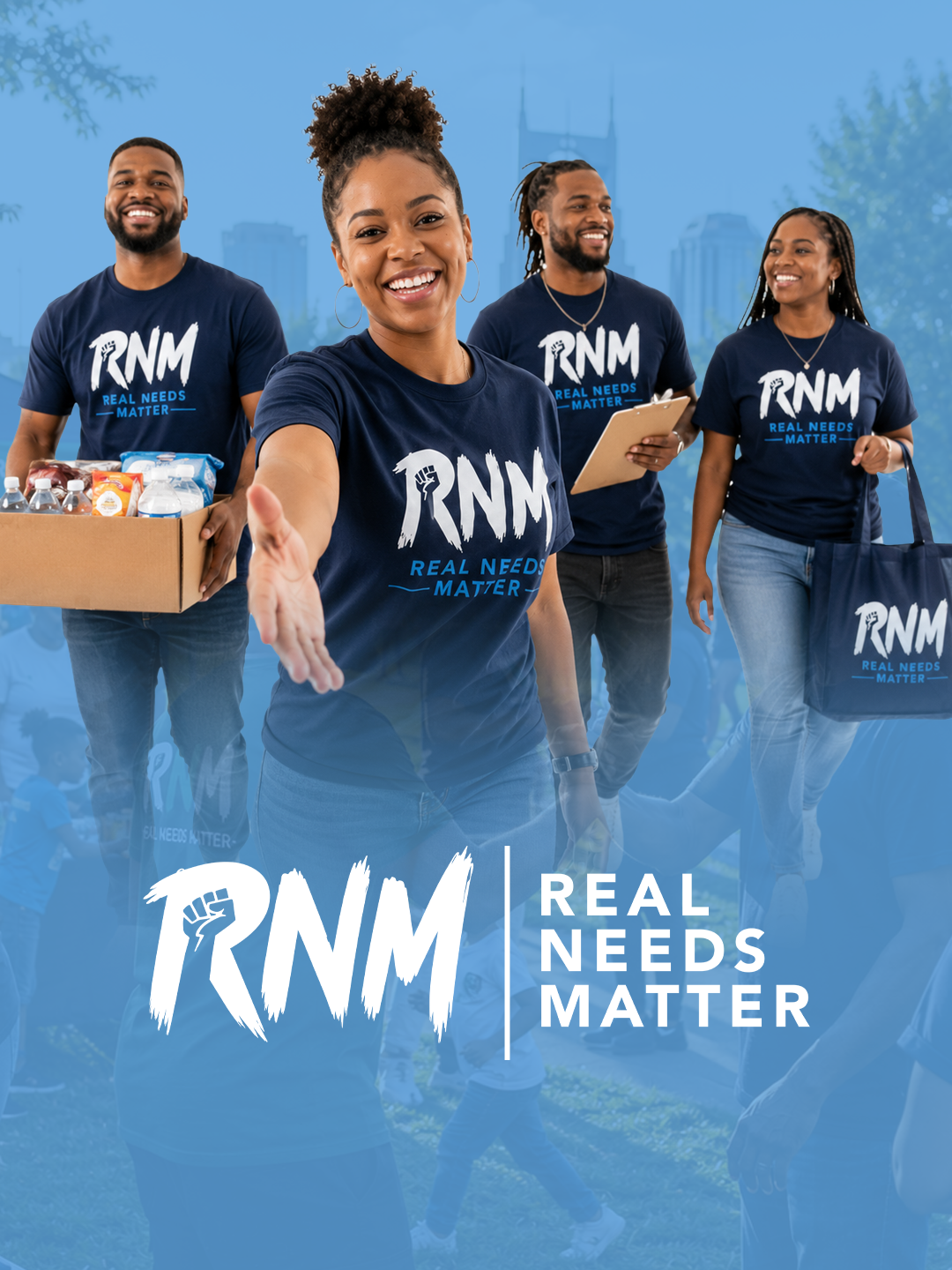
Real People. Real Purpose. Real Impact.
Real Needs Matter (RNM) believes communities become stronger when people can access the support, resources, and opportunities they need.
Through outreach, events, giving initiatives, partnerships, and hands-on support, RNM connects real resources with real people.
02 / THE BRIEF
RNM was a new organization without an established brand identity or digital platform. The goal was to create something vibrant, engaging, and welcoming that reflected unity and encouraged community participation.
Build a recognizable nonprofit brand from the ground up.
Communicate unity, accessibility, and shared purpose while making it easier for people to stay informed and get involved.
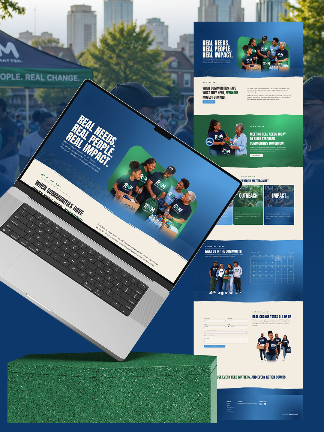
Brand strategy, visual identity, social media kit, printed marketing materials, and responsive one-page website.
03 / THE STRATEGY
The strategy centered on making community involvement feel welcoming, accessible, and worth being part of.
Community isn't just who they serve. It's who they are.
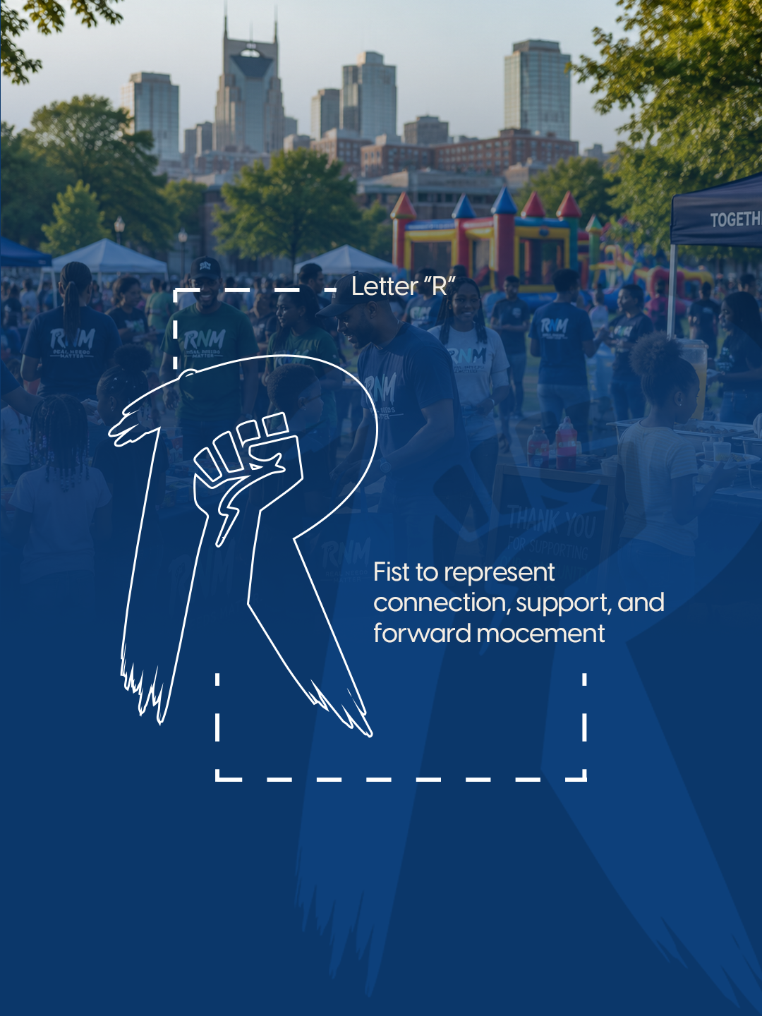
We positioned RNM around connection, participation, and collective progress.
A little color. A lot of purpose.
Vibrant navy, sky blue, forest green, and warm neutrals balance credibility with energy and approachability.
Built to bring people together.
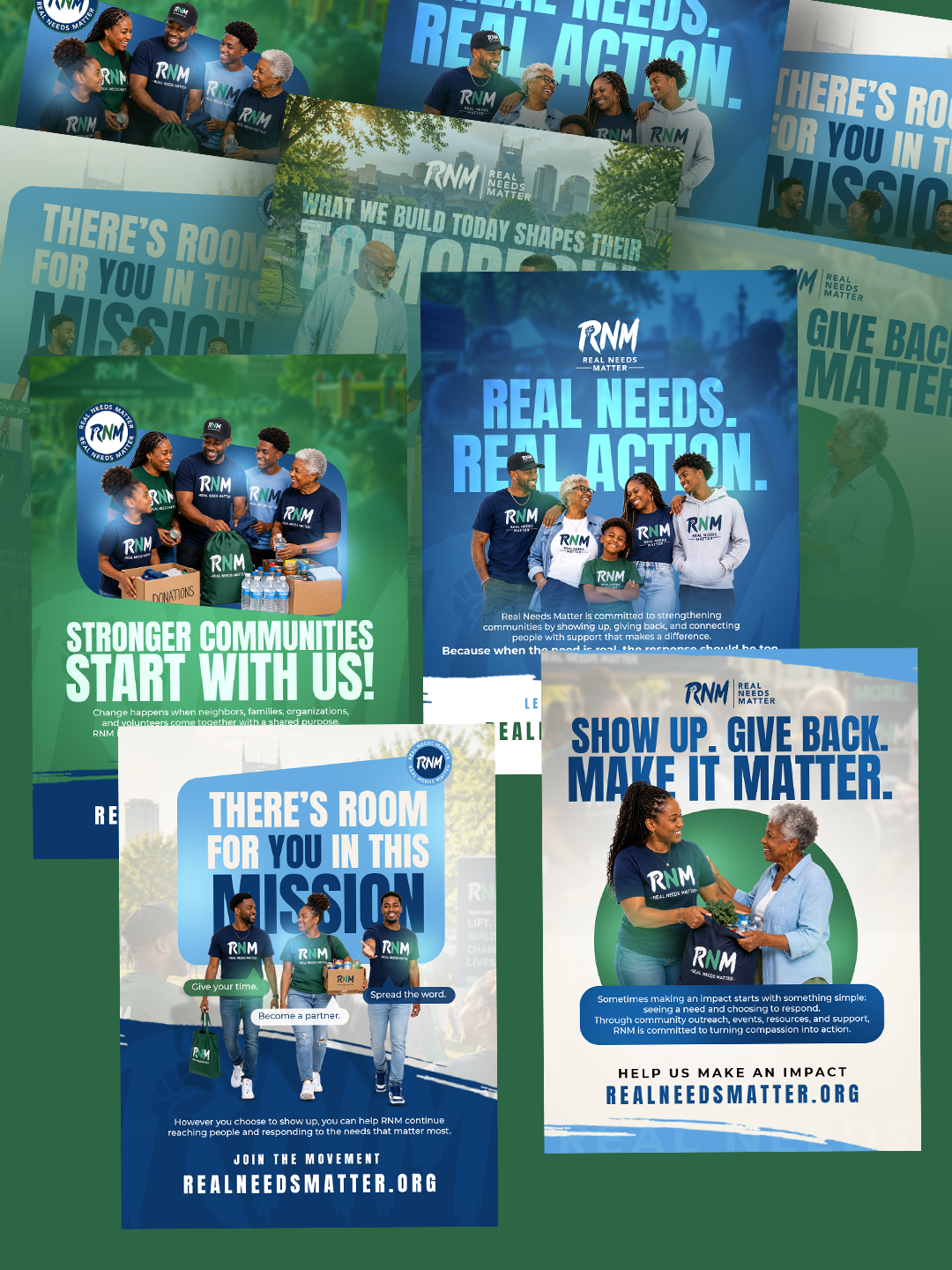
We developed a cohesive identity, social media assets, printed materials, and a website for events, updates, and involvement.
04 / THE WORK
A vibrant, purpose-driven brand system designed to turn community awareness into meaningful participation.
A foundation built on unity and community engagement.
An energetic, welcoming identity grounded in trust.
Consistent visuals for initiatives, events, and updates.
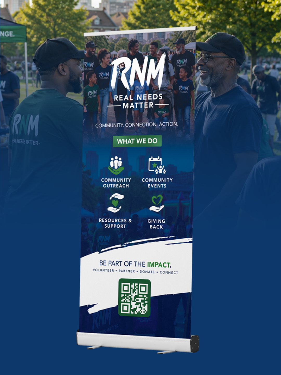
Branded materials for community spaces and events.
A central hub for events, updates, and ways to get involved.
05 / THE OUTCOME
A stronger presence for a mission that matters.
Real Needs Matter launched with a cohesive visual identity and a professional digital presence that gives the organization a recognizable foundation.
From social media to printed materials, every touchpoint now communicates a consistent message of unity, purpose, and community involvement.
The new website serves as RNM’s central digital hub, giving visitors an accessible place to discover upcoming events, explore community initiatives, stay informed, and learn how they can participate.
The experience was designed to make connecting with the organization simple and approachable.
The completed brand gives RNM a more established and credible presence while providing the tools needed to communicate its mission consistently.
With a dedicated website and coordinated marketing materials, the organization now has a stronger foundation for building awareness, encouraging participation, and supporting future community initiatives.
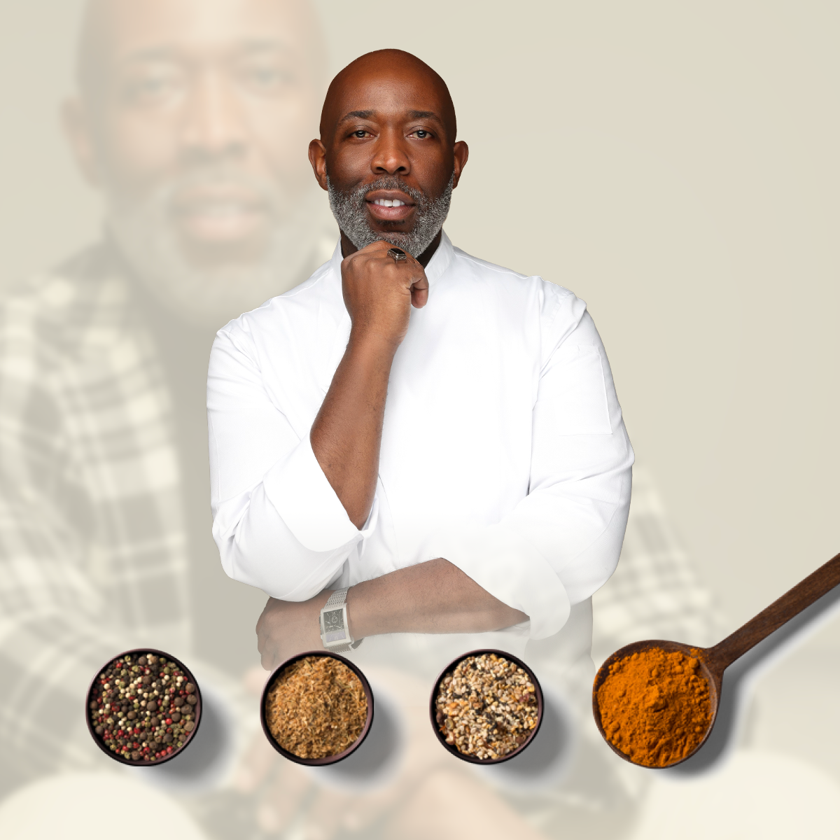
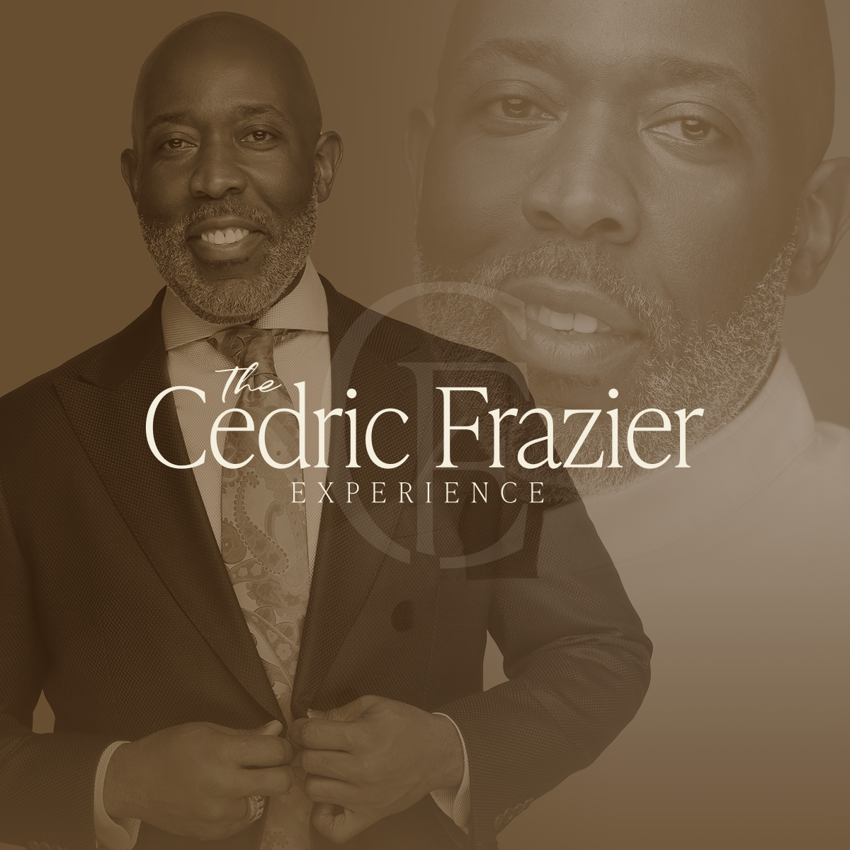
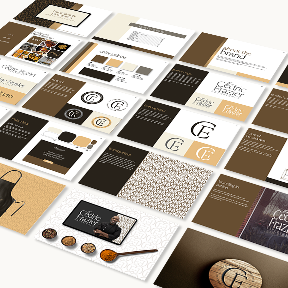
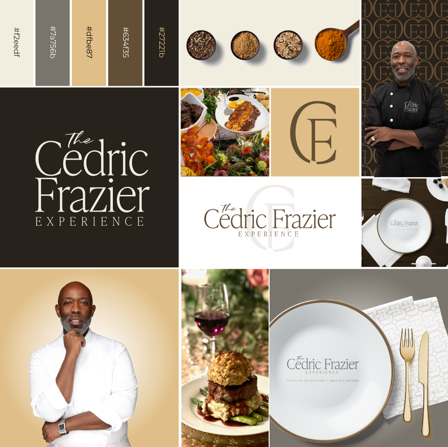
An Exceptional Experience Deserves an Exceptional Identity.
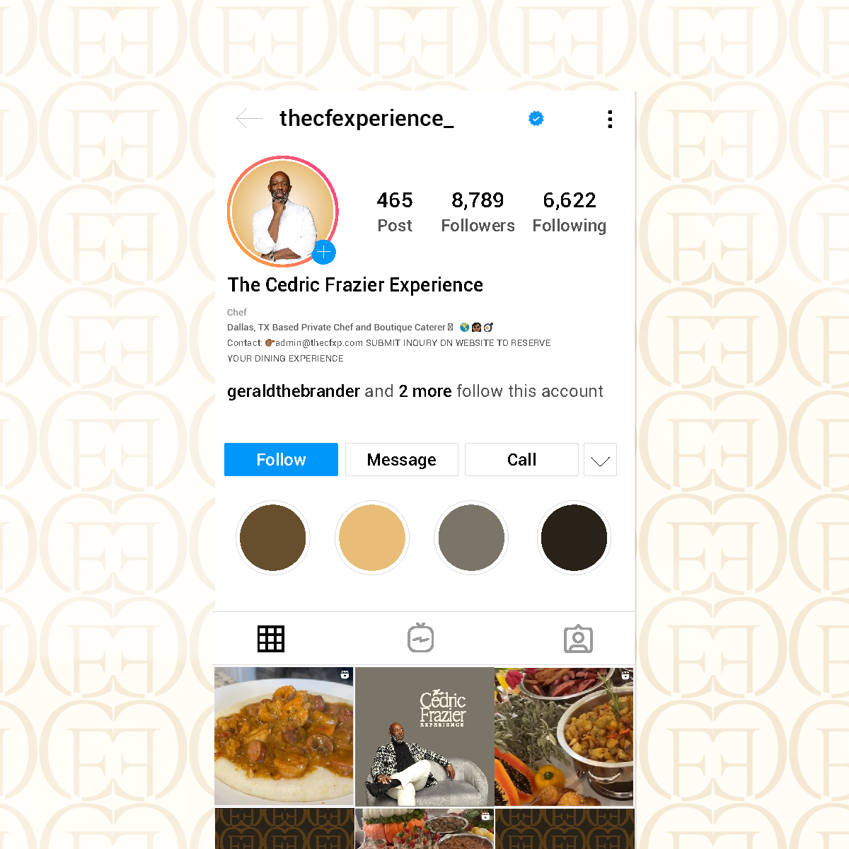
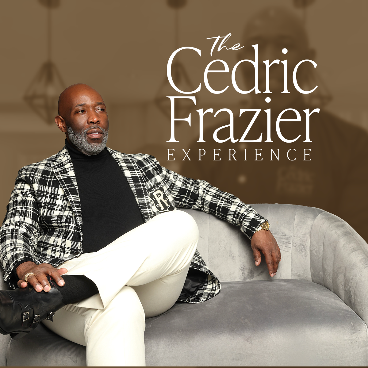
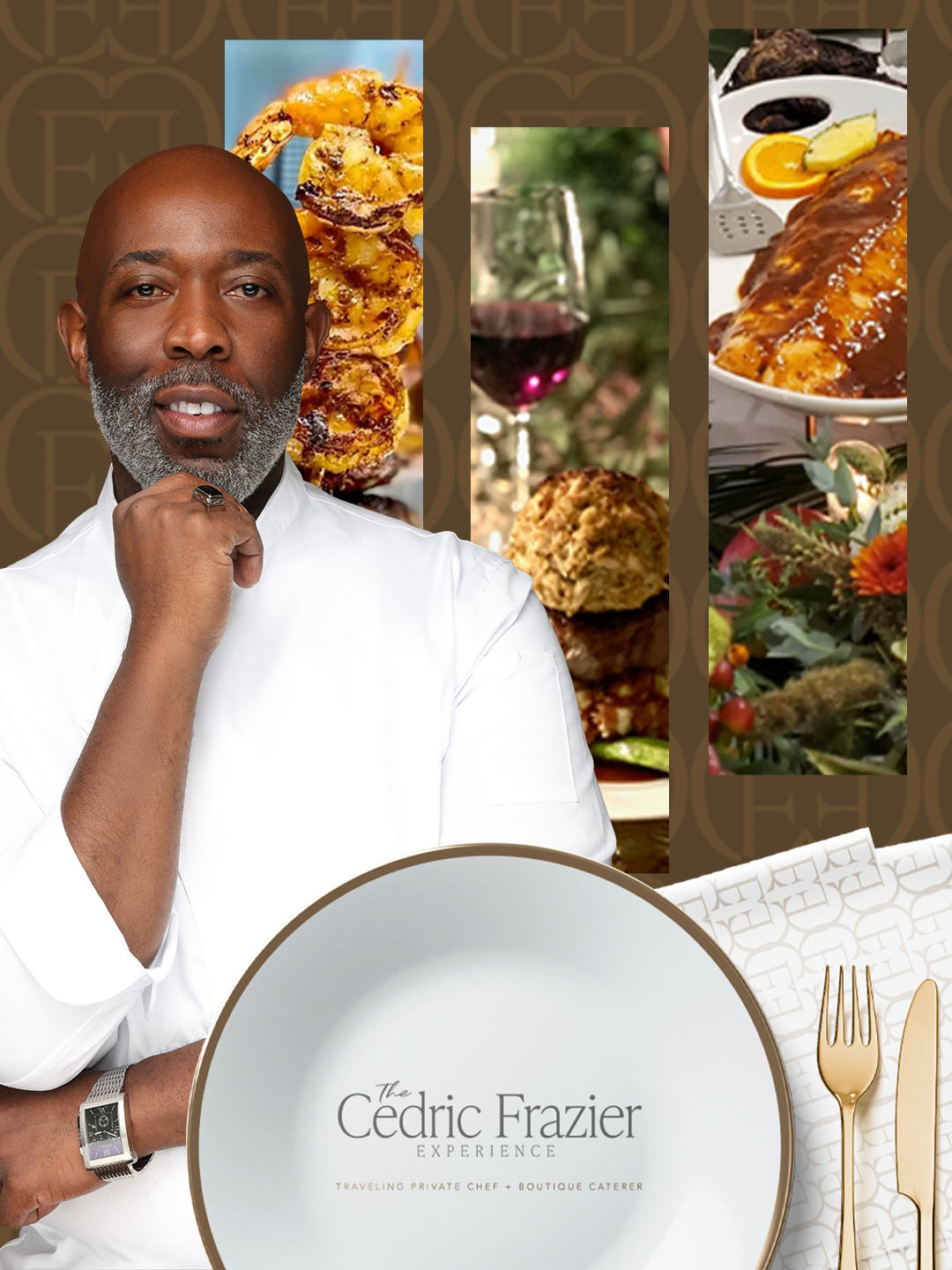
The Cedric Frazier Experience is a premium culinary and hospitality brand built around Chef Cedric Frazier's expertise and carefully curated experiences.
Cedric had the talent and experience. He needed a cohesive brand that communicated the same level of quality.
02 / THE BRIEF
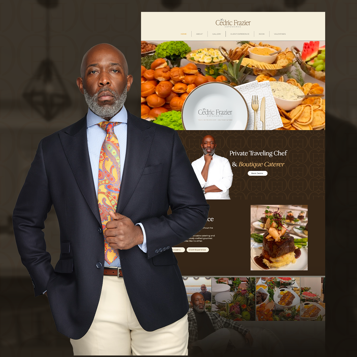
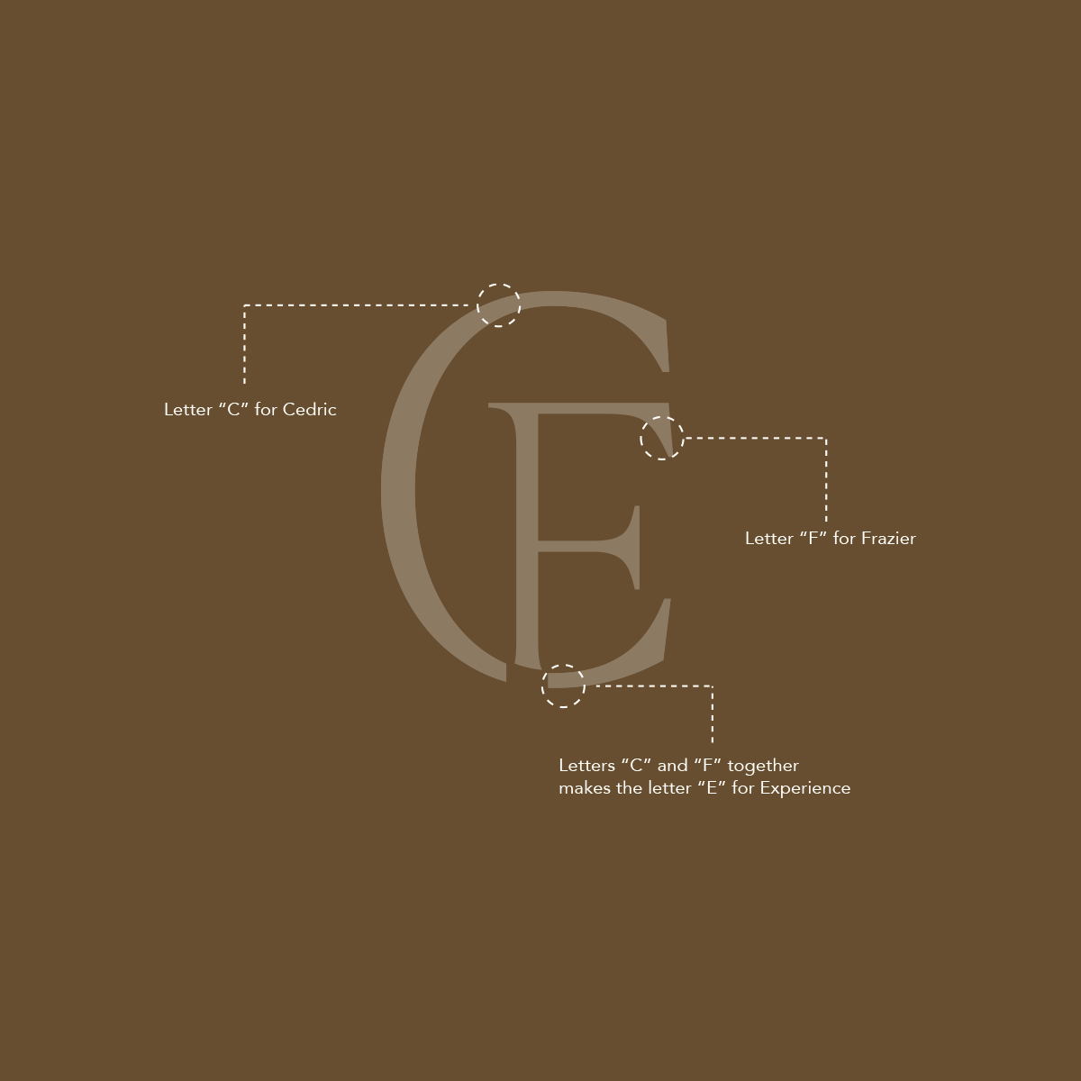
Cedric had a logo and professional experience, but lacked a complete brand strategy, consistent visual identity, marketing materials, and website. His vision called for a unique luxury aesthetic that matched the high-end experiences he delivers.
Turn a limited brand presence into a complete luxury hospitality identity.
Communicate culinary excellence, exclusivity, and thoughtful service through a distinctive, consistent brand.
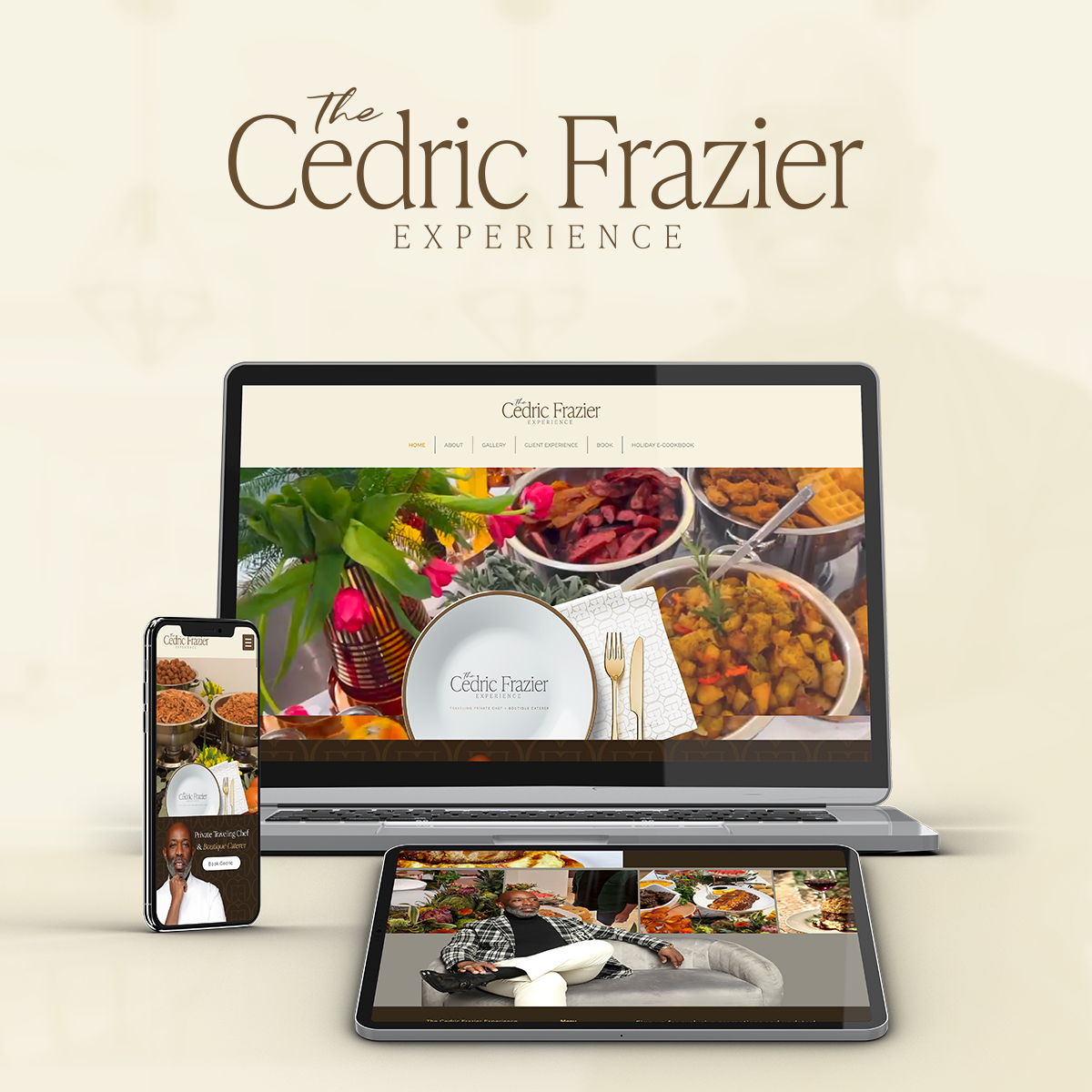
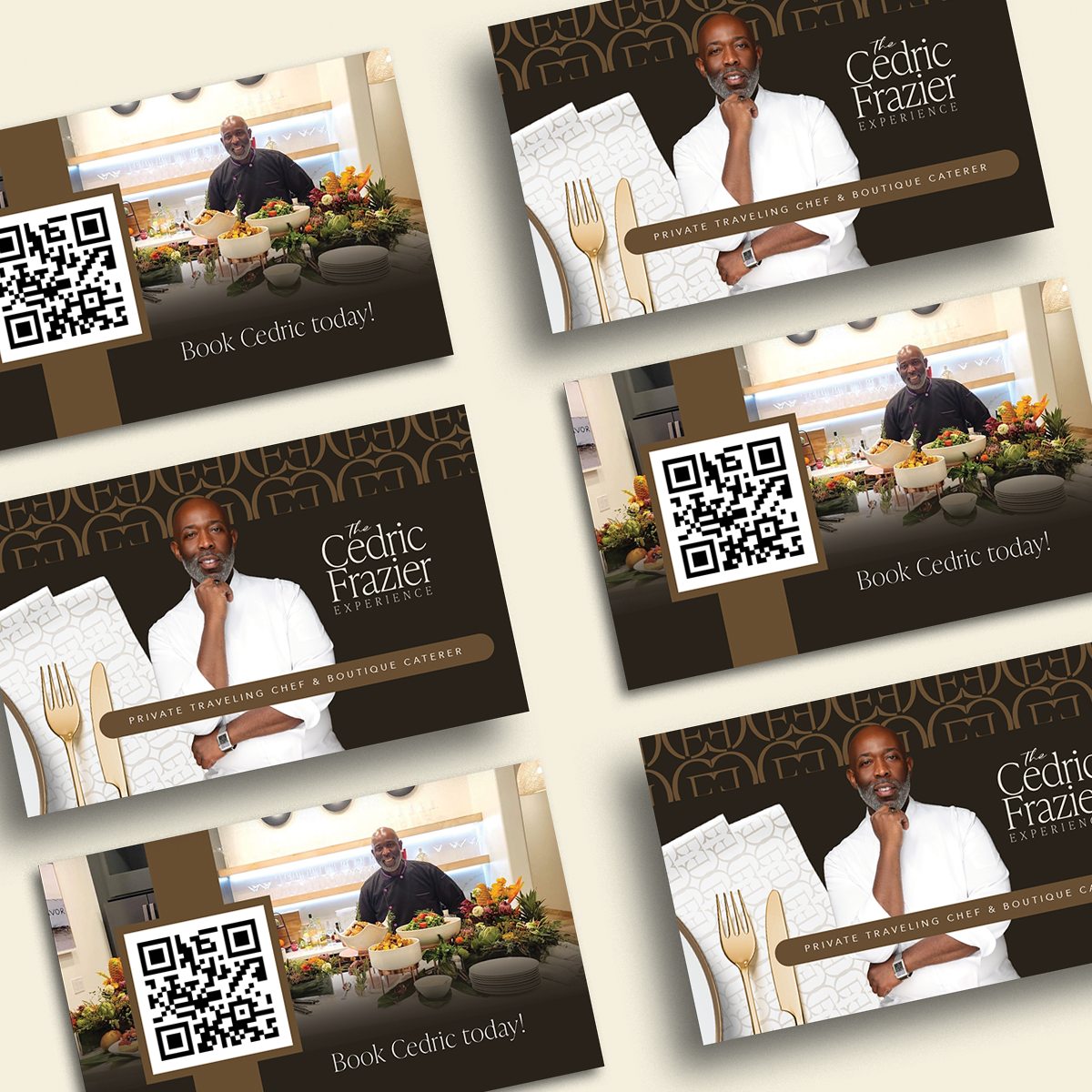
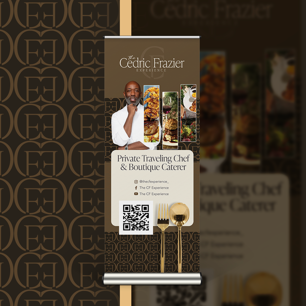
Brand strategy, visual identity, social media kit, printed marketing materials, and full website.
03 / THE STRATEGY
Luxury is more than appearance. It is the expectation created at every point of contact.
Not just catering. A curated experience.
We focused the brand on personalized hospitality and memorable experiences rather than only the food.
Quiet luxury. Lasting impressions.
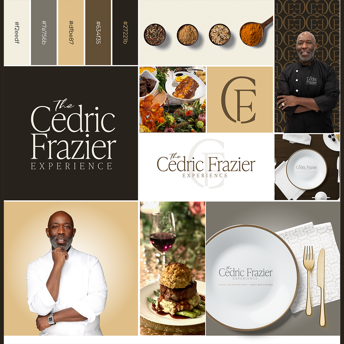
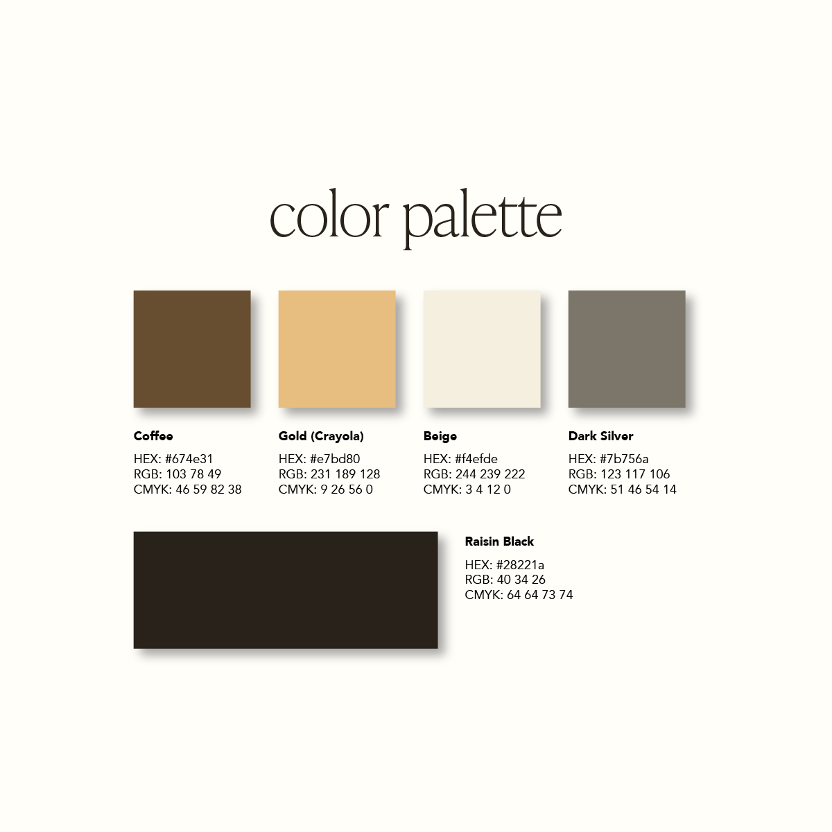
Warm ivory, rich brown, champagne gold, and understated neutrals establish a refined, timeless visual identity.
Every detail, intentionally branded.
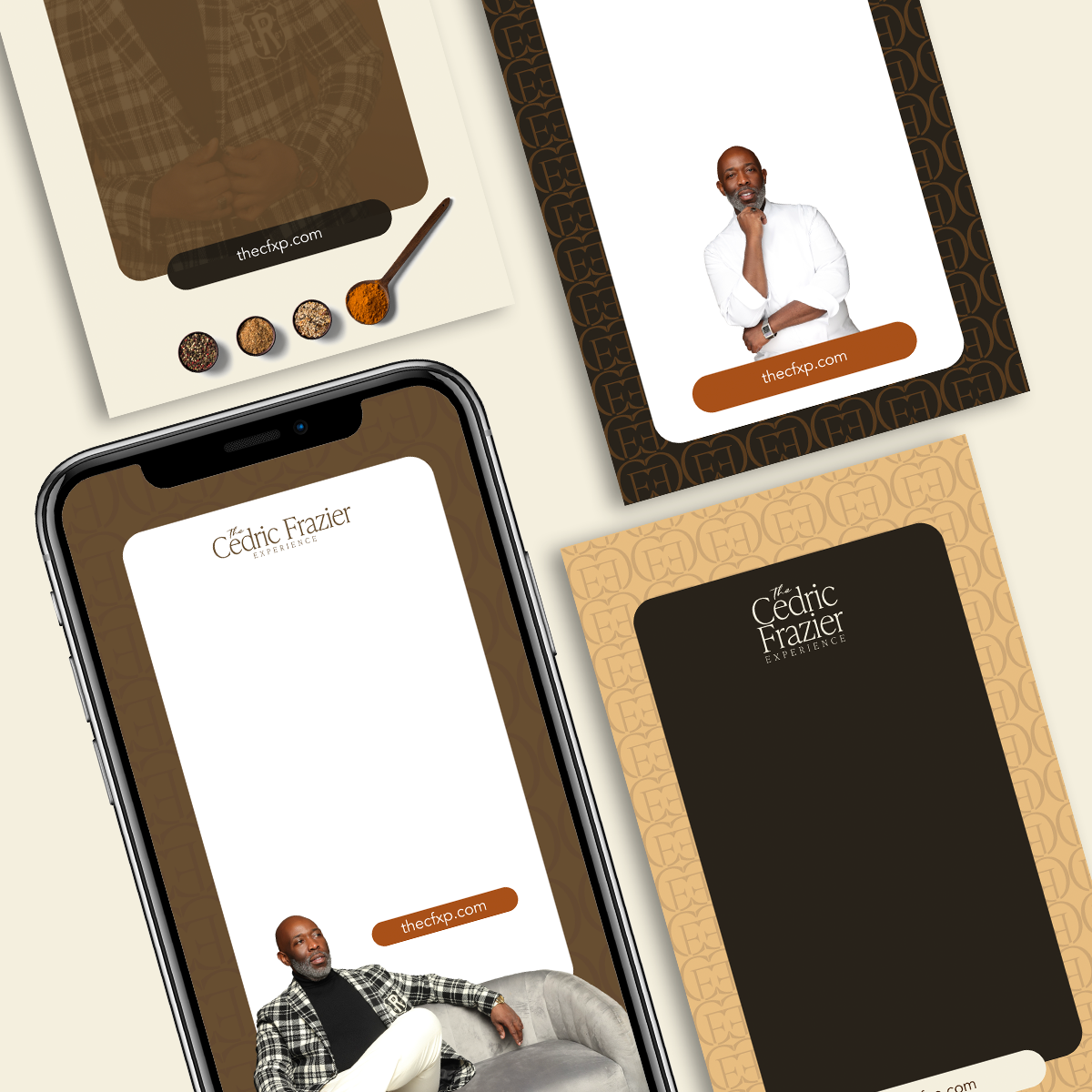
The strategy carried through the identity, social media kit, printed materials, and full website.
04 / THE WORK
A sophisticated brand system designed to make every interaction feel like the beginning of an exceptional experience.
Premium positioning centered on personalized hospitality.
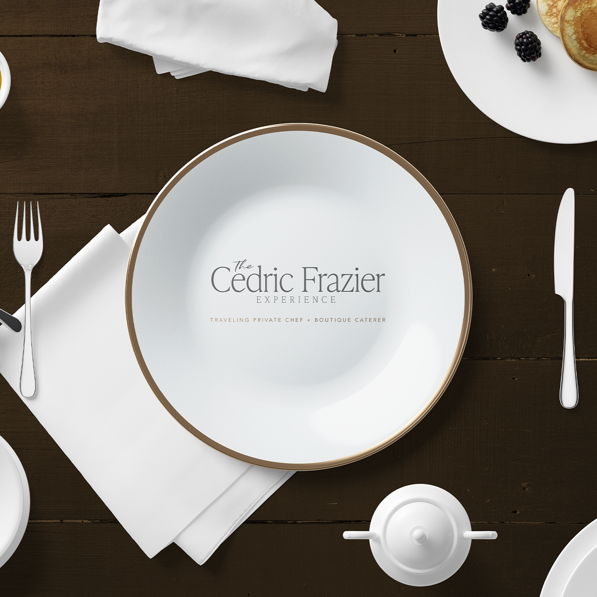
A refined and cohesive luxury identity.
Consistent assets for an elevated online presence.
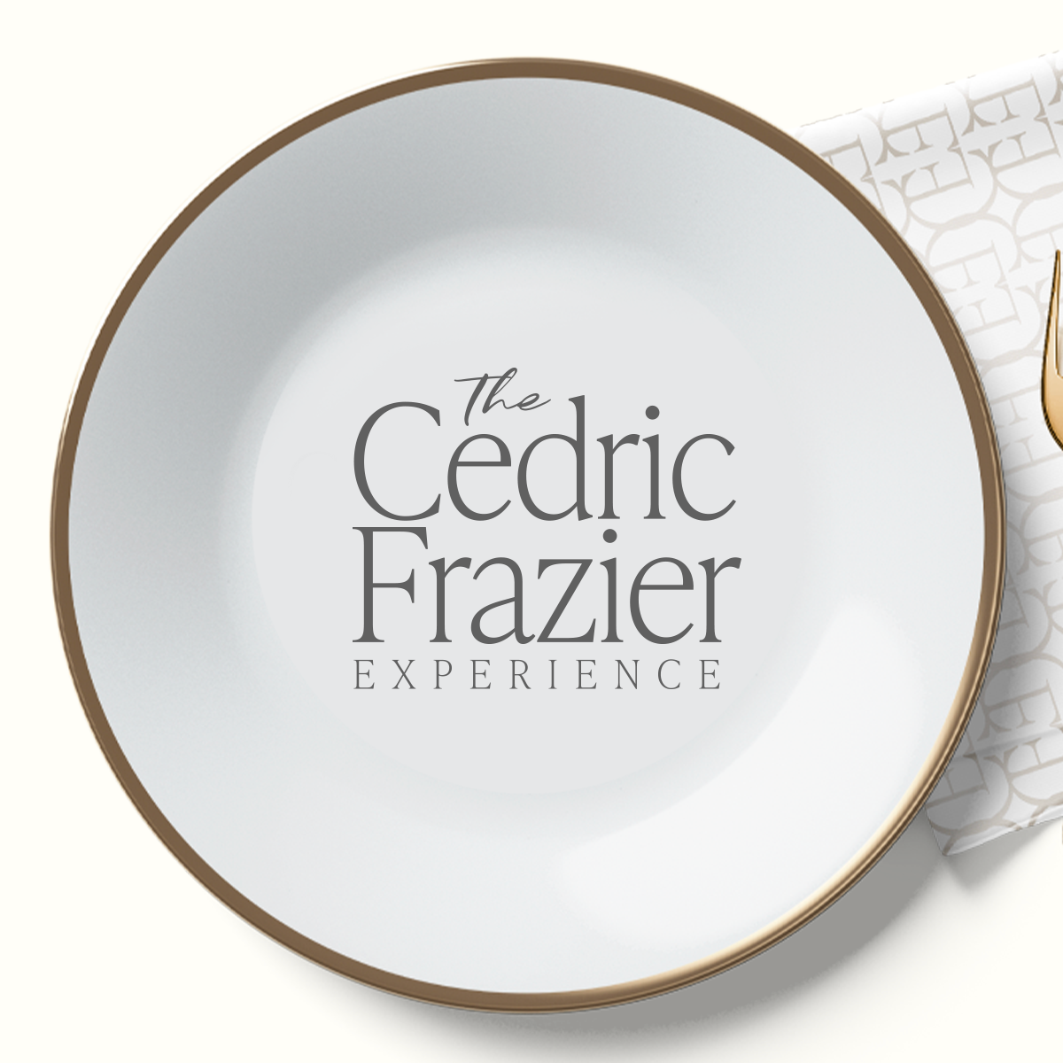
Branded materials that extend the experience offline.
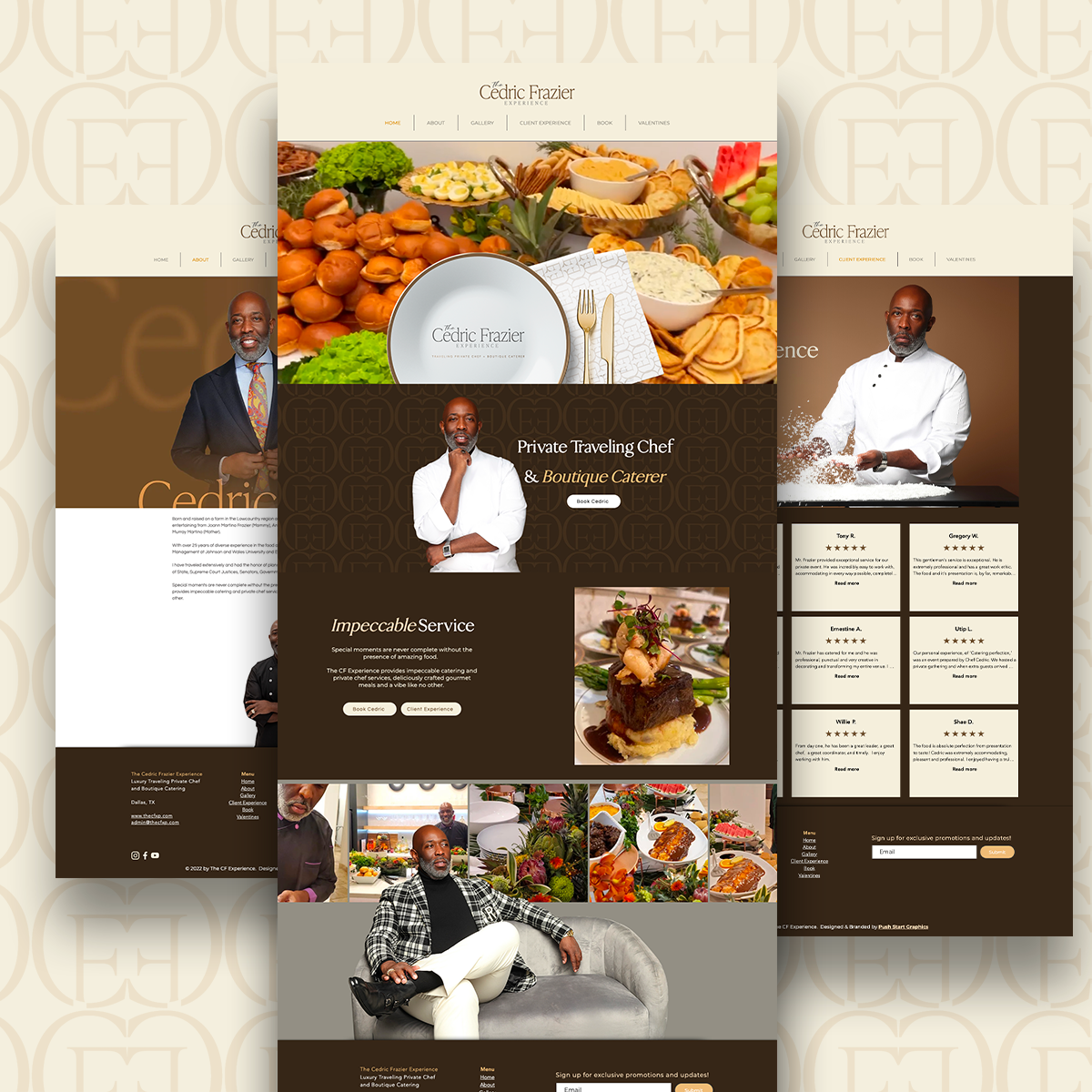
A comprehensive digital destination for services, brand storytelling, and inquiries.
05 / THE OUTCOME
From a culinary brand to a growing hospitality experience.
The Cedric Frazier Experience emerged with a cohesive luxury identity that reflects the quality, professionalism, and attention to detail behind Cedric’s services.
With a complete brand system and coordinated marketing materials, the business established a consistent presence across digital and physical touchpoints.
The website became a central destination for prospective clients to discover Cedric’s culinary background, explore his services, view his work, and submit inquiries.
The experience was designed to communicate the value of his offerings while making it easier for visitors to take the next step.
With a stronger brand foundation and Cedric’s continued commitment to showing up consistently, The Cedric Frazier Experience has expanded beyond its original offerings.
The business now includes branded cookware and additional hospitality ventures, including a separate venue business for which we also developed the logo.
What began as a comprehensive branding project has grown into an ongoing creative relationship supporting an expanding business.
Made to Stand Out. Designed to Be Remembered.
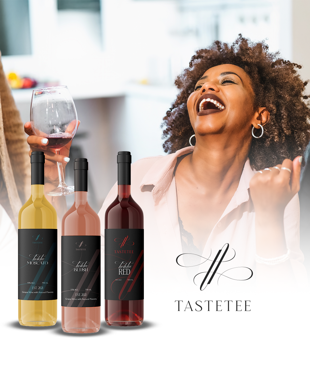
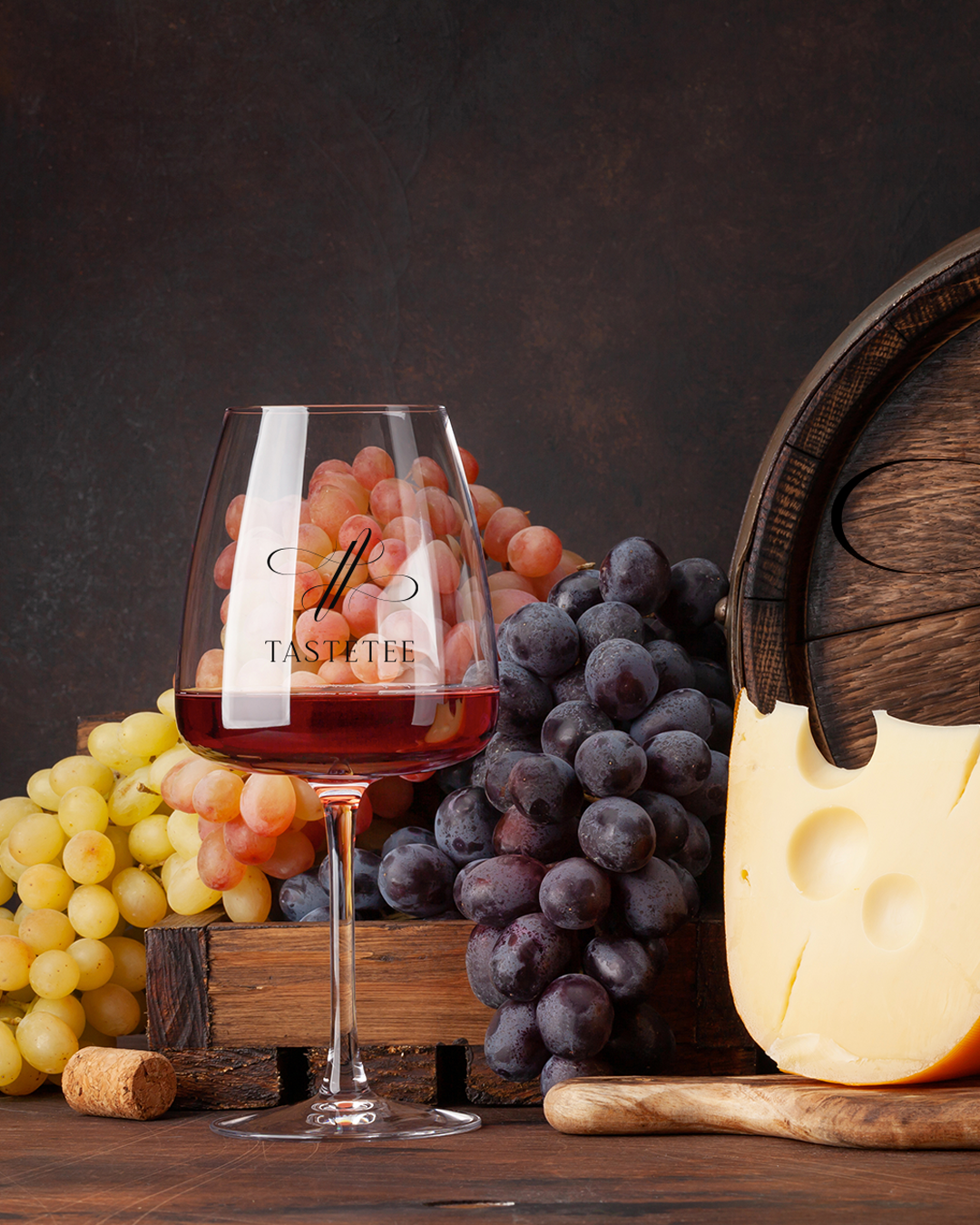
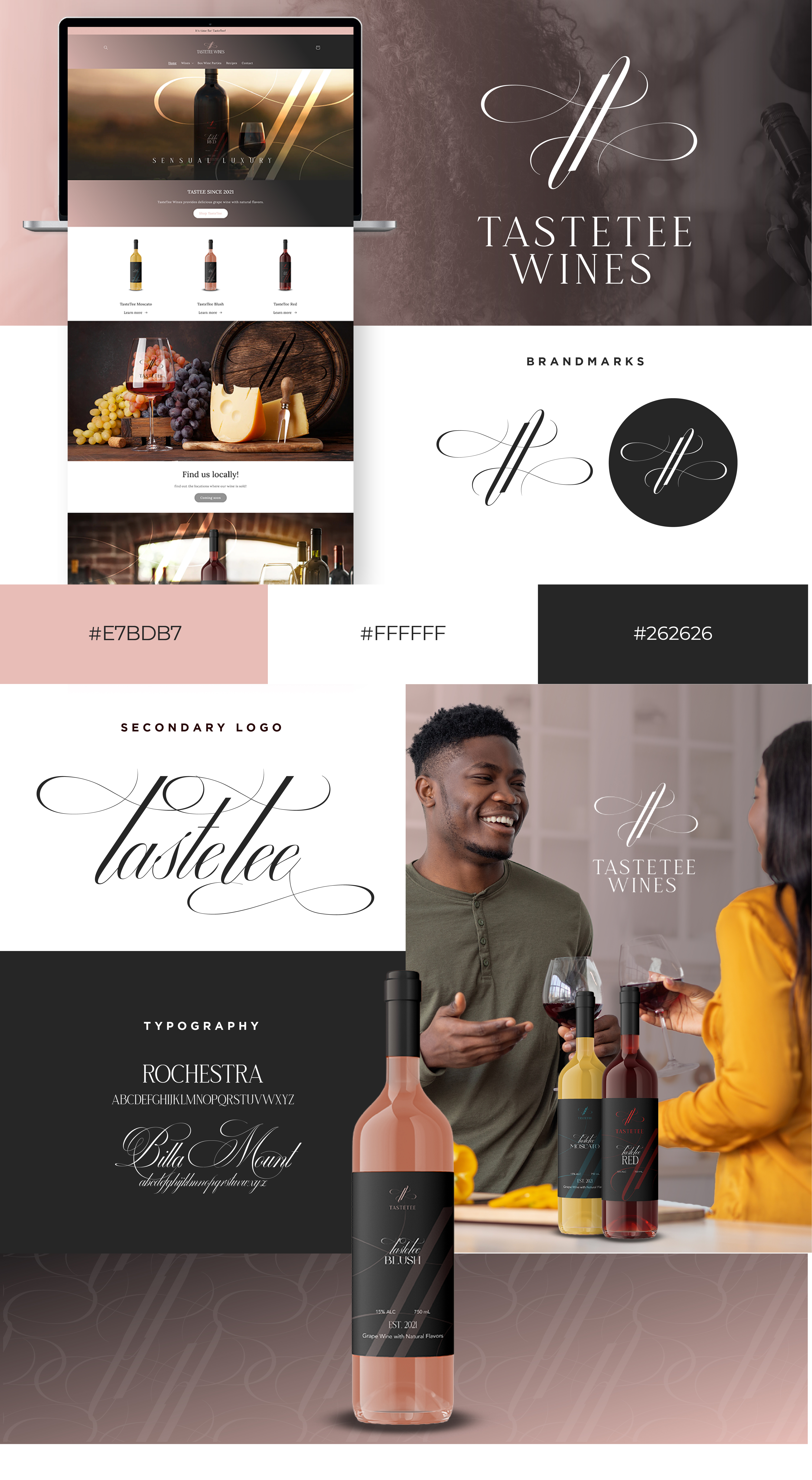
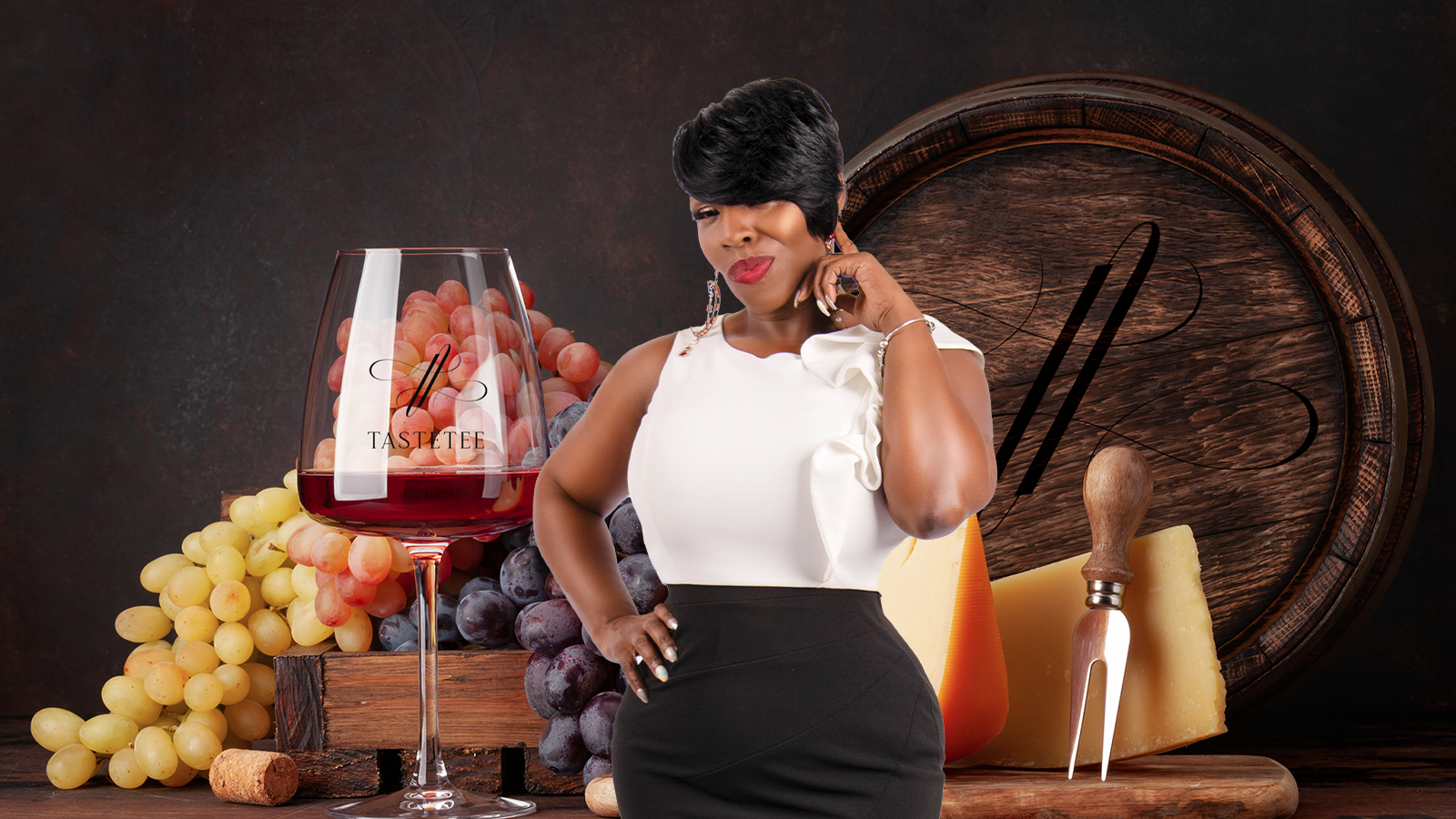
Founded by Katrina in Georgia, TasteTee Wines is a wine brand offering a variety of red, white, and rosé wines.
Entering a market filled with established names and recognizable labels, TasteTee needed more than an attractive bottle.
It needed a distinctive identity that could capture attention, create recognition, and give customers a reason to take a closer look.
The mission was to build a brand that could make an impression on the shelf and carry that same personality into the digital shopping experience.
02 / THE BRIEF
TasteTee Wines was preparing to enter the market without an established brand strategy, visual identity, packaging system, or digital presence.
Starting from the ground up created an opportunity to define how the brand would look, feel, and communicate before its first launch.
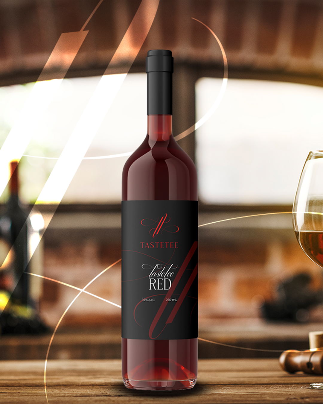
Katrina wanted something distinctive. A visual identity that could stand apart from traditional wine branding, supported by an iconic mark that customers could recognize at a glance.
The challenge was to create a cohesive brand system that worked across multiple wine varieties while establishing a memorable presence both physically and online.
Develop a distinctive identity for a new wine brand entering a competitive market without an existing visual system, product packaging, or digital storefront.
Create a memorable, recognizable brand that stands out on the shelf, maintains consistency across wine varieties, and connects with its intended audience.
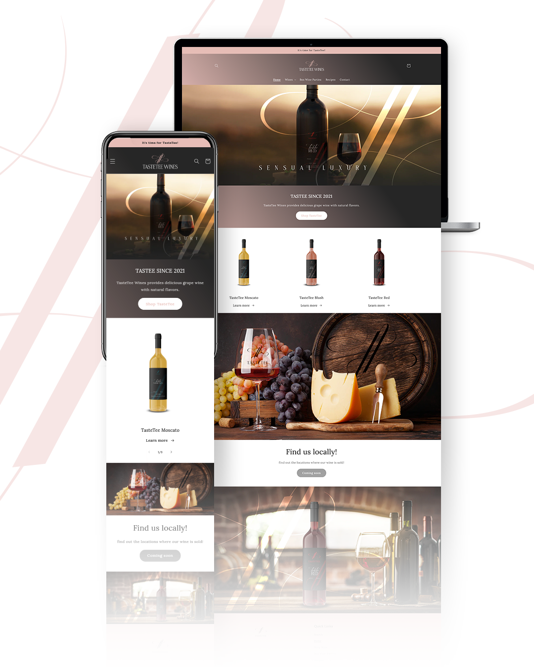
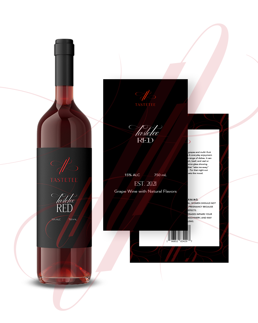
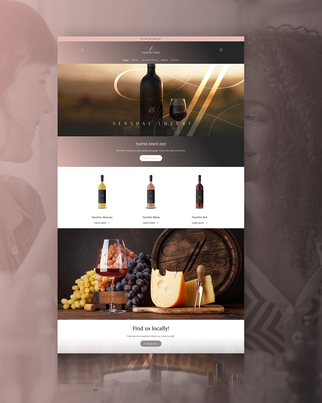
Brand strategy, visual identity development, a scalable wine label design system, and a full e-commerce website with age verification and online purchasing functionality.
03 / THE STRATEGY
The strategy centered on creating immediate recognition.
From the first glance at a bottle to the first interaction with the website, every touchpoint needed to communicate a distinctive personality while maintaining a consistent brand identity.
Not another bottle on the shelf.
We positioned TasteTee Wines around individuality, recognition, and a memorable brand experience.
The objective was to create a visual presence that could distinguish TasteTee from competing wine brands while remaining approachable to its intended audience.
An identity worth a second look.
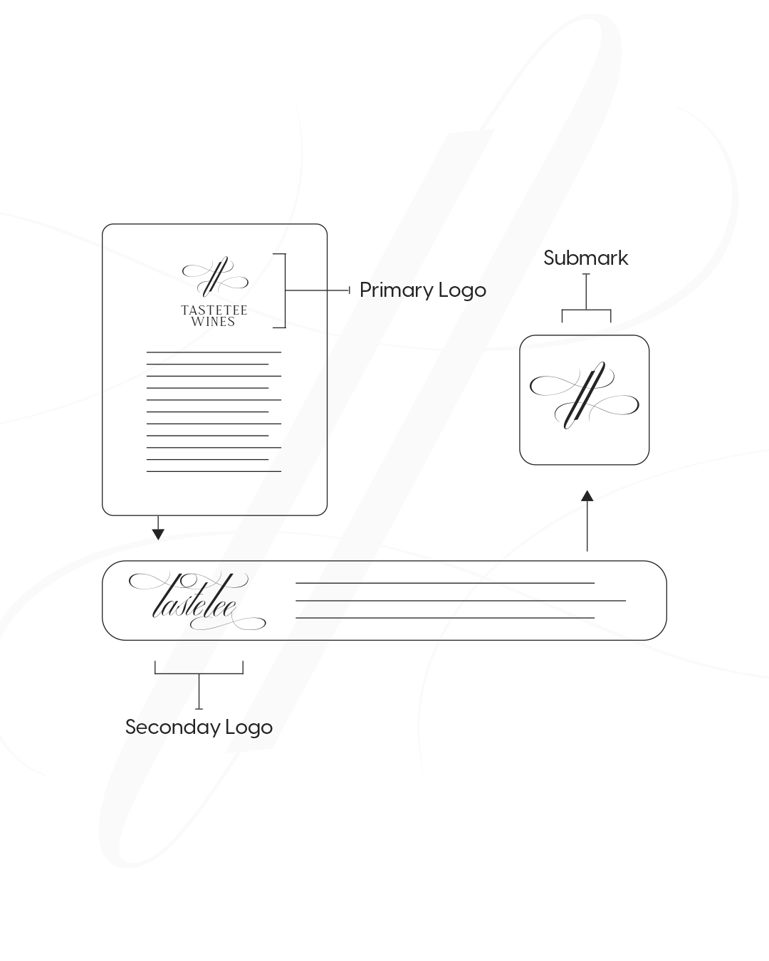
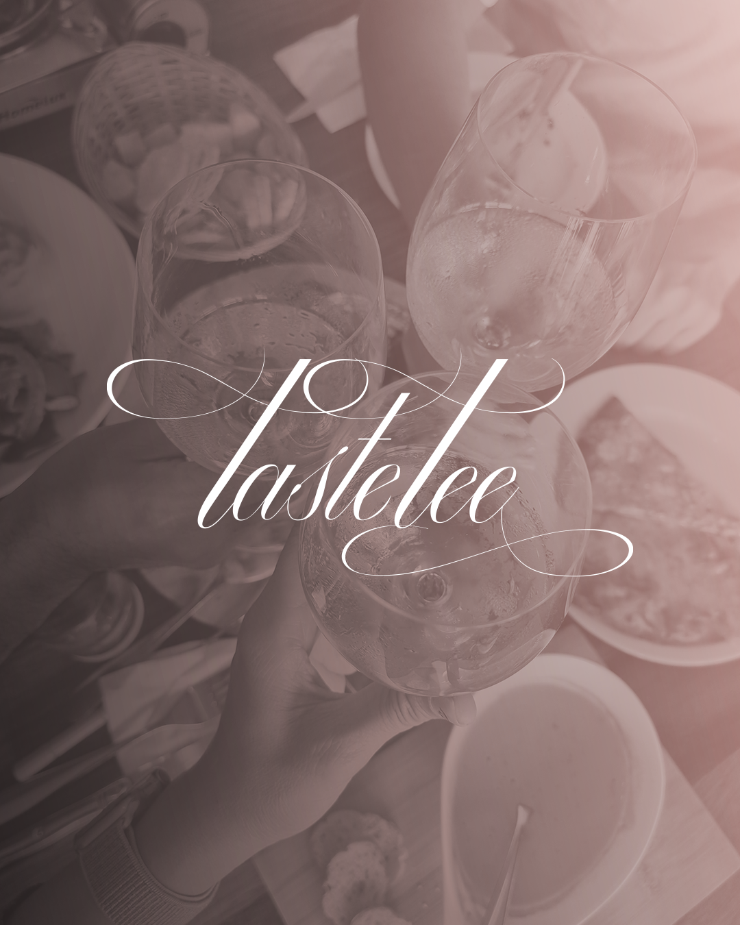
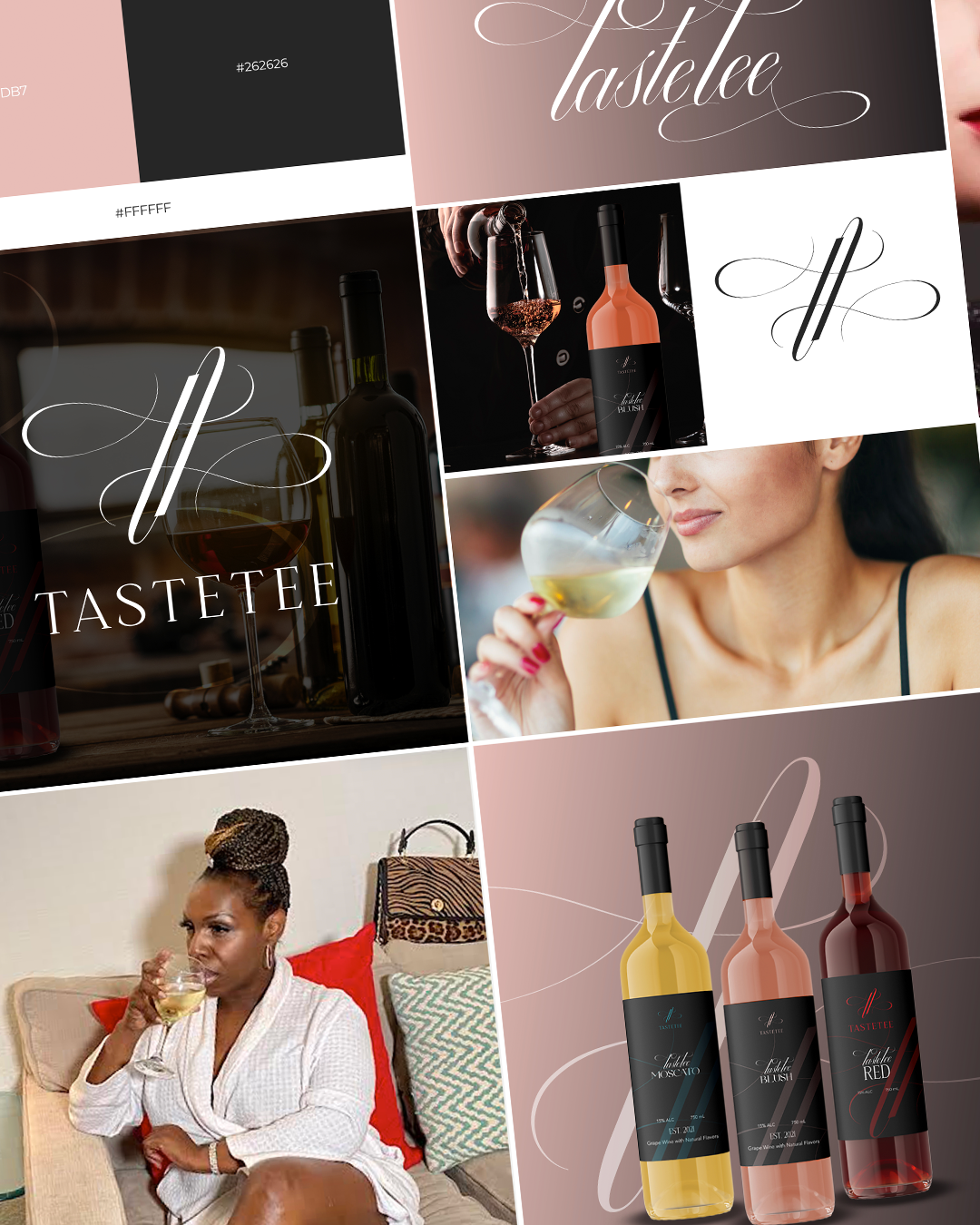
A distinctive brand mark became the visual anchor of the identity, supported by a refined palette of muted rose, white, and charcoal.
The creative direction balanced contemporary sophistication with a recognizable personality, creating a look designed to stand apart without relying on overly complicated visuals.
From the label to the checkout.
We developed a cohesive identity that extends across multiple wine labels and a complete e-commerce website.
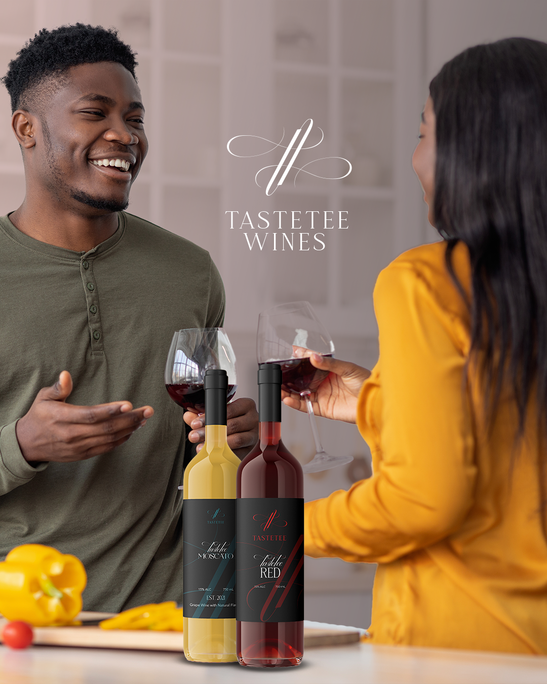
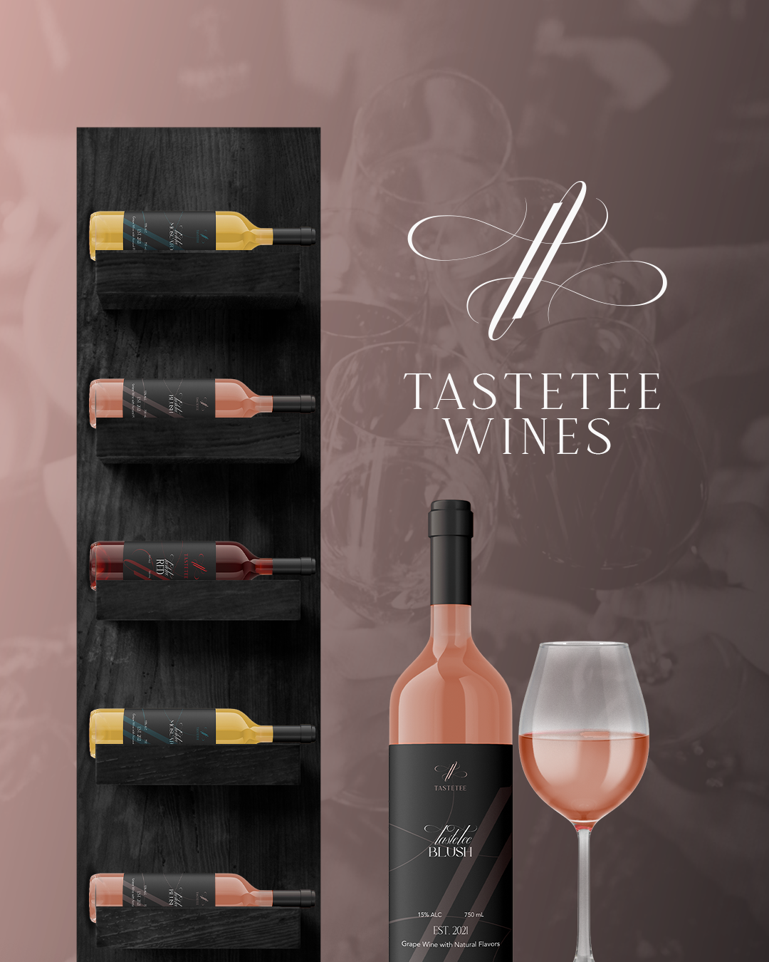
The label system maintains consistency across red, white, and rosé varieties, while the website brings the products together in a dedicated shopping experience with age verification and purchasing functionality.
04 / THE WORK
A distinctive visual identity and product experience designed to make TasteTee recognizable wherever customers encounter the brand.
A clear positioning foundation focused on recognition, differentiation, and brand consistency.
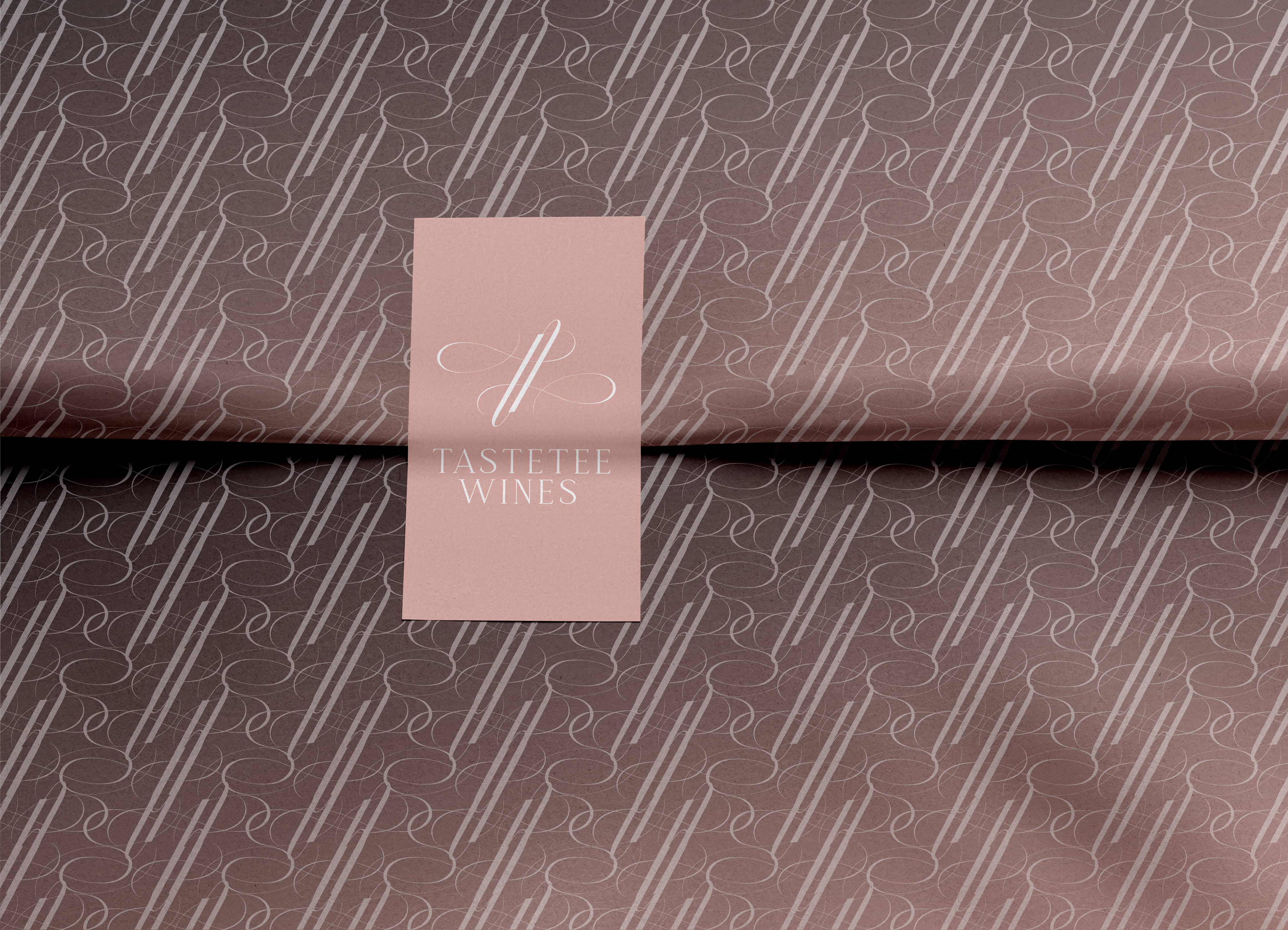
A memorable brand mark and cohesive visual system designed to establish a distinctive presence.
A scalable packaging system that creates consistency across red, white, and rosé varieties while allowing each product to maintain its own identity.
A complete online storefront featuring product discovery, age verification, and purchasing functionality.
05 / THE OUTCOME
From a new idea to a brand ready for the shelf.
TasteTee Wines launched with a distinctive visual identity and a cohesive label design system that gives its products a recognizable presence.
The new brand established a consistent foundation across its wine varieties, creating a unified presentation from bottle to bottle.
The e-commerce website introduced a dedicated digital destination where customers can explore available wines, complete age verification, and purchase products online.
The website extends the brand’s visual identity into a shopping experience designed to feel cohesive, approachable, and easy to navigate.
The completed project gave TasteTee Wines the visual identity, packaging system, and digital infrastructure needed to launch.
With a distinctive brand presence and a functioning online storefront, TasteTee was able to introduce its products, connect with its target audience, and establish a foundation for continued growth.
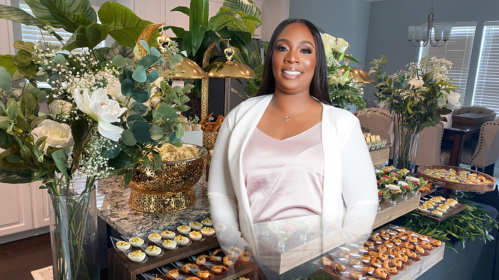
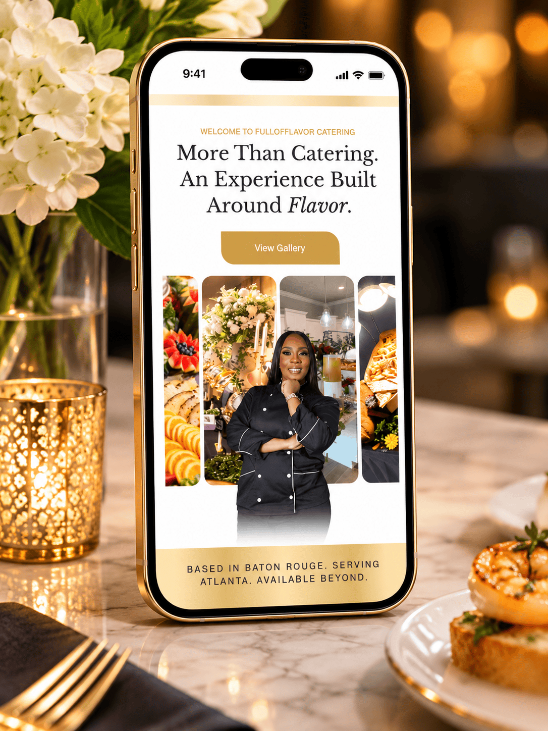
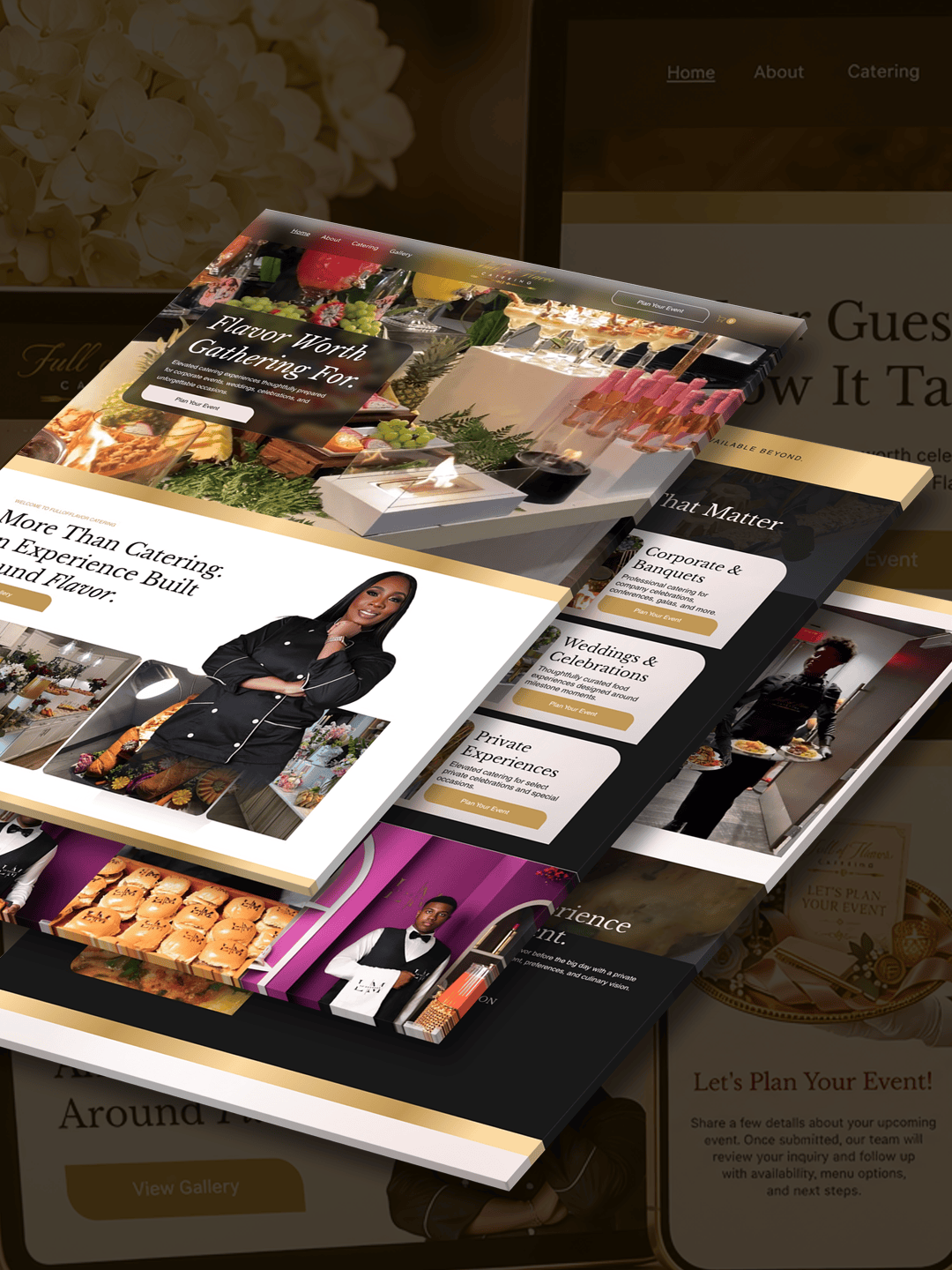
Elevated Catering Deserves an Elevated Online Experience.
With a growing business and an established catering service, the brand needed a digital presence that reflected the quality of its offerings while making it easier for prospective customers to explore services and submit inquiries.
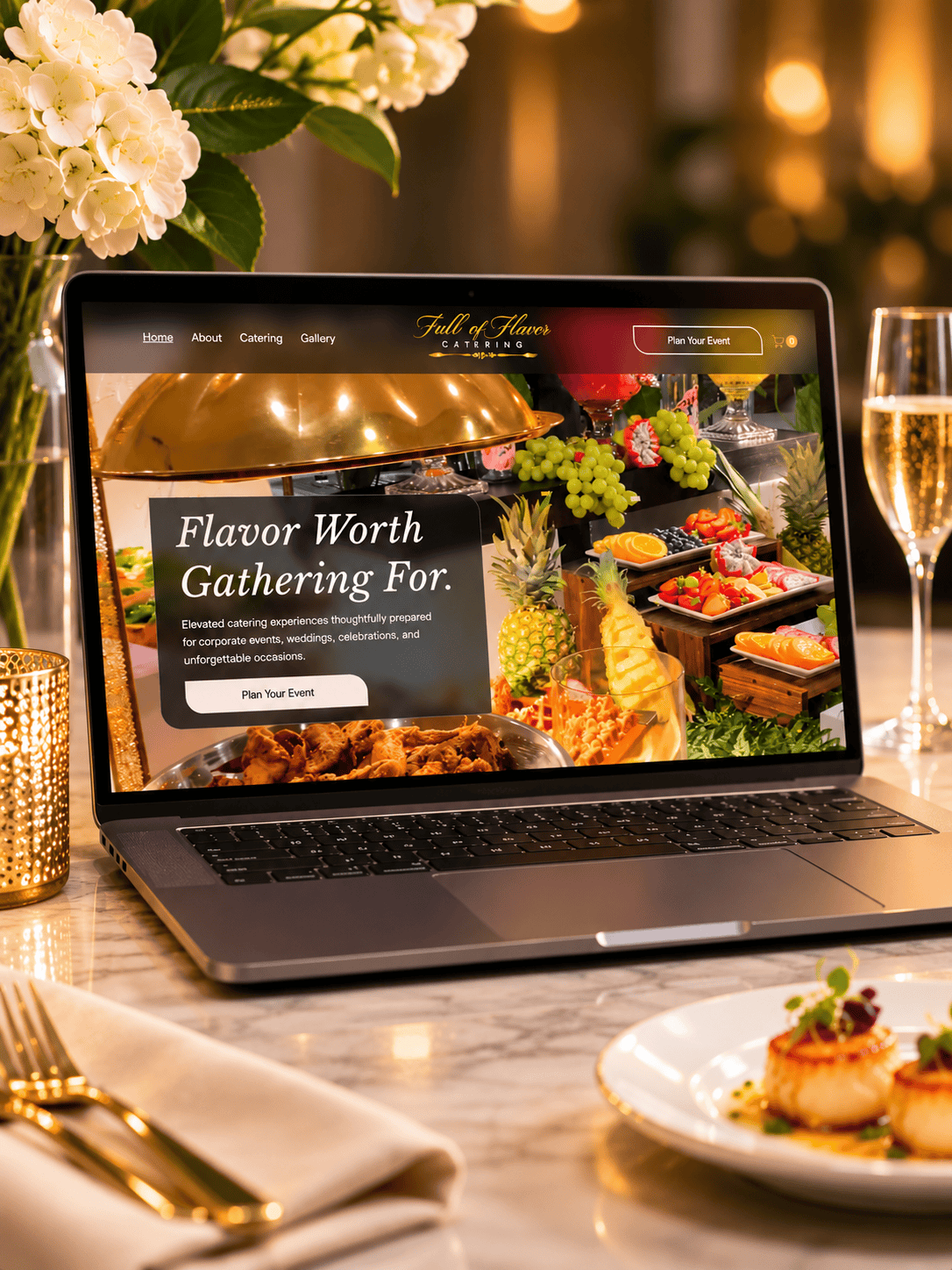
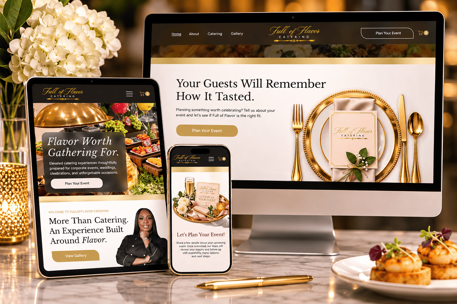
The solution was a custom website designed to bring the brand’s offerings, visual presentation, and inquiry process together in one seamless experience.
02 / THE BRIEF
Before the project, Full of Flavor Catering didn’t have a dedicated website.
The business relied on a Google Form to collect catering inquiries, leaving prospective customers without a central destination to explore its packages, view previous work, or fully experience the brand online.
The challenge was to create a professional online presence that could communicate the brand’s offerings while making the inquiry process more convenient.
03 / THE STRATEGY
An Experience Worth Exploring.
Position Full of Flavor Catering as a professional catering brand offering elevated experiences, supported by an online presence that communicates quality, credibility, and attention to detail.
Let the Experience Speak.
Create a polished, visually engaging website that gives the brand’s culinary offerings room to shine.
Prioritize clear navigation, attractive presentation, and an intuitive customer journey.
Everything in One Place.
Develop a custom website where visitors can explore catering packages, browse the gallery, learn about available offerings, and submit inquiries without navigating multiple platforms.
04 / THE WORK
Custom Website Experience
A centralized digital destination designed around the customer’s journey.
Visitors can explore available packages and better understand the services offered.
A dedicated space to showcase the brand’s culinary presentation and catering experiences.
Clear, accessible information helps visitors understand the brand’s offerings.
An integrated inquiry experience allows prospective customers to connect directly through the website.
05 / THE OUTCOME
From Google Forms to a Digital Experience That Delivers.
A professional, custom-designed website that gives Full of Flavor Catering its own online presence.
Customers can now explore catering packages, browse the gallery, discover available offerings, and submit inquiries through one cohesive website.
12+ Catering Inquiries in Just 2 Weeks
Within the first two weeks of launching the website, Full of Flavor Catering received more than a dozen inquiries.
A meaningful early result demonstrating how a dedicated online presence can support customer engagement and business growth.


CONNECTING…


Every great project starts with understanding the bigger picture. Share a few details about your business, goals, and investment so I can determine the best way to move forward.
INQUIRY RECEIVED / NEXT, LET’S TALK
Your inquiry is in! Now that I have a better understanding of what you’re looking to accomplish, let’s take the next step and talk through your vision.
BOOK YOUR CONSULTATION45-minute virtual consultation • $50 investment • Google Meet
BACK TO STUDIOLet’s discuss your goals, explore opportunities, and map out your brand’s next move.
Your $50 consultation fee is credited toward your final project invoice if we both decide to move forward.
This 45-minute creative strategy session is an opportunity to discuss your business, clarify your goals, identify potential solutions, and determine whether we’re the right fit to work together.
New here? I recommend first so we can make the most of our conversation.
Everything you might want to know before we get started.
Submit an inquiry through the Start a Project form. I’ll review your business, goals, and project needs to determine the best next steps.
Not at all. You can share the challenges you’re facing, and we’ll explore which creative solutions make the most sense.
I’ll review your submission and follow up with the appropriate next steps, which may include scheduling a consultation.
Projects begin at $850. Your final investment depends on the strategy, scope, and support required.
Yes. Flexible payment structures are available for qualifying projects. Available arrangements may include full payment upfront or an agreed-upon installment schedule.
Yes. Your $50 consultation fee is credited toward your final project invoice if we mutually agree to move forward.
Timelines depend on the project’s scope, complexity, and how quickly required materials and feedback are provided. An estimated schedule will be established for your specific project.
Two rounds of revisions are included unless otherwise specified in your project agreement. Additional revisions may require an additional fee.
Feedback, project updates, and approvals are managed through your dedicated client portal.
Final deliverables are provided according to your project agreement. Native or editable source files are not included unless explicitly purchased or otherwise agreed upon.
You’ll receive your approved final deliverables once your project balance has been paid in full, according to the delivery terms in your agreement.
Absolutely. Additional services can be discussed and quoted based on your needs and current availability.
Now that we’ve cleared a few things up, let’s talk about what you’re building.
Here’s how we keep projects organized, communication intentional, and the creative process moving forward.
These policies provide an overview of how Gerald the Creative operates. Individual projects are governed by their signed service agreements and applicable law.
Now that you know how I work, let’s talk about what you’re building.
THE GROUND RULES
To protect focus, quality, and consistent delivery across client projects, communication is handled with intention and structure.
Most project communication is managed through the designated client portal.
Email is not monitored continuously. Messages are reviewed and responded to during designated business hours and between scheduled work sessions.
Immediate or last-minute email responses should not be expected.
Monday through Friday:
Central Time
These times represent scheduled email review windows, not guaranteed response times.
All meetings, consultations, and calls must be scheduled in advance.
Requests to change an appointment must be confirmed before the scheduled meeting time.
An unconfirmed request does not change an existing appointment.
If a client does not join a scheduled meeting within 10 minutes of its start time, the session will automatically close and be considered missed.
These guidelines are designed to respect everyone’s time, maintain an organized workflow, and protect the focused creative work each project requires.
THE GROUND RULES
By engaging Gerald the Creative for services, clients agree to the payment terms outlined in their individual project agreement.
Projects begin at $850.
Final pricing is determined by the strategy, scope, complexity, and support required.
Payment may be required in full upfront or through an agreed-upon installment plan.
Depending on project eligibility, available arrangements may include:
The approved payment structure will be documented in the project agreement.
Deposits are non-refundable, subject to applicable law and the terms of the signed agreement.
All outstanding project balances must be paid before final deliverables are released.
Gerald the Creative may pause work on projects with overdue payments, subject to the project agreement.
Work requested outside the approved project scope will be quoted and invoiced separately.
Additional services will not be included automatically.
If a client cancels a project, payments already made will be handled according to the cancellation terms in the signed project agreement and applicable law.
Any cancellation fees, refunds, or outstanding balances will be determined by those terms.
Native or editable source files are not included unless explicitly purchased or otherwise agreed upon in writing.
THE GROUND RULES
Timely communication and collaboration are essential to keeping projects moving forward.
Clients are responsible for providing requested information, materials, approvals, and feedback within agreed-upon timelines.
Delays in receiving necessary materials or feedback may affect the project’s completion date and overall schedule.
If communication is interrupted or a project must be paused, the client should notify Gerald the Creative as soon as possible.
Projects that experience extended periods of inactivity may be rescheduled based on current availability.
Any changes to the project scope, timeline, or financial terms will be communicated and agreed upon before work resumes.
Clear communication, mutual respect, and timely collaboration help ensure a smooth and productive creative process.
THE GROUND RULES
While every effort is made to maintain agreed-upon project schedules, unexpected circumstances may occasionally affect availability or delivery timelines.
These circumstances may include illness, injury, emergencies, technical failures, service interruptions, natural disasters, or other events outside reasonable control.
When such circumstances occur, Gerald the Creative will communicate relevant delays as promptly as reasonably possible.
Where necessary, project timelines may be adjusted to accommodate the interruption.
Any revised schedule will be communicated to the client.
This policy does not override rights or obligations established by applicable law or the signed project agreement.
THE GROUND RULES
Gerald the Creative observes the following standard business hours:
Monday through Friday
10:00 AM to 5:00 PM Central Time
Weekends and U.S. federal holidays are not considered standard business days.
Additional planned non-working days will be communicated at least seven days in advance whenever reasonably possible.
THE GROUND RULES
Clients receive the final approved deliverables specified in their project agreement once all applicable payment obligations have been satisfied.
Drafts, revisions, unused concepts, working documents, and layered source files remain the property of Gerald the Creative unless otherwise agreed upon in writing.
Native or editable source files are not included in standard deliverables unless explicitly purchased or otherwise specified in the project agreement.
Premium fonts, stock assets, software, themes, plugins, and other third-party materials may be subject to separate licensing terms.
Ownership or usage rights for these materials are governed by their respective licenses.
The client’s rights to use, reproduce, modify, or distribute final creative deliverables are determined by the project agreement and any applicable third-party licenses.